Image analysis
Image analysis is not only good for school. If you are able to analyze and describe other images, you can design your own images more creatively and develop a better understanding of how images are constructed. This way you don’t leave your image effect to chance anymore!
What is image analysis?
An image analysis describes an image both optically/visually (in terms of appearance) and in terms of content or information content.
What is the purpose of image analysis?
Based on the image analysis, a blind person should theoretically be able to imagine the image (this statement roughly describes the accuracy of the analysis description).
Sense and aim of an image analysis?
By analyzing a picture more often, one learns to better interpret the most important features that make up a picture and not just accept it as it is. You can better recognize the dynamics and effect of a picture and, if necessary, learn to better see the meaning that the artist wanted to express.
If you use images for websites, posters or flyers, for example, you will select them more carefully and in a more suitable way in terms of content and appearance.
To put it briefly:
One becomes more aware of the essential image features and the way an image works.
How does an image analysis work?
When describing the analysis, one proceeds according to an ordered pattern.
The image is described in different ways. All in all, the laws of design are the most important criterion for describing images.
For this reason, the description of landscapes, for example, is different from that of portraits.
Also, not every law of design has to be taken into account. If certain features are not recognizable in the picture, one can at most consider the effect that this feature is missing (if this comes into play at all).
The Semiotic Model
- Syntactics (form of the image)
- Semantics (interpretation of the single characters)
- Pragmatics (interpretation of the image)
1. introduction of the image
(with the most important available information)
- Title of the picture
- Name and most important data of the artist
- Date of creation/ era
- Size and material/ method of realization
- Where is the picture now?
- What does the picture obviously represent (motive)?
2. syntactics
(optical description of the image)
- Motive (what is depicted)
- Color
- Contrast
- Material
- Technique
- Light/ shadow (plasticity)
- Spatiality/ Perspective
- Composition
- further characteristics of the design laws
3. semantics
(meaning of the image)
- What do we see and how do we interpret what we see?
4. pragmatics
(What does the picture tempt you to do)
- Intention of the artist/ function
- Effect
- Is the title of the picture comprehensible to the viewer?
Application example
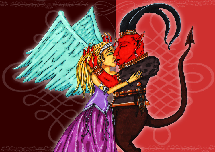
1. presentation of the picture
– Title of the picture
“When an angel kisses a devil”.
– Name and main data of the artist
Stefanie Panitz (Nightmage),
born on 16.07.1982 in Nagold, Germany
– Date of creation/ era
January 2009
– Size and material/ type of realization
DIN A4 landscape format
ink, touch marker, marker paper
Pencil sketch, contours drawn, colored & shaded, background created on PC (Adobe Photoshop)
– Where is the picture now?
At the artist
– What does the picture obviously represent (motif)?
An angel and a devil kissing each other.
2. syntactics
You can see a red devil on the right and an angel dressed in purple on the left. Both are kissing. The image is in total focus (all elements of the image are equally important). The background is divided into 2 different shades of red. The dark shade of red is on the angel’s side, the light shade of red is on the devil’s side. Both red tones meet in the middle behind the couple.
Together with the couple in the foreground and the background itself, both a light-dark contrast and a tone-on-tone color contrast have been created. Because of this separation, the figure-ground relationship (that is, the contrast of foreground to background) is very clear.
The image itself has been created using a variety of materials and techniques. On the one hand, the contours of the figures in the foreground are traced with black ink, on the other hand, the figures themselves were colored with Touch Twin Markers in different shades.
Likewise, the shading has been created with markers. So that the marker color itself comes into its own better, special marker paper was used. Light reflections were added with a white gel pen and further shading with colored gel pens. The background was created on the PC with the program Adobe Photoshop. Likewise, the decorations of the background were added with so-called brushes in Photoshop.
Shading is only on the two people in the foreground. There is no clear illumination, however, based on the placement of the shadows, the light tends to come from above.
Light reflections have also been placed above the jewelry of both persons and on the hair of the angel. Nevertheless, the persons do not seem very three-dimensional, since there is no background shading and the contours close off the figures too much. Spatiality is therefore not given in this picture. The main focus is thus visibly on the two figures in the foreground.
A fairly normal perspective (frontal view) has been chosen, which lets you see the essentials (upper body up to just above the knees) of the figures. Except for the two figures in the foreground, there are no other objects or figures in the picture.
The figures are in the center of the picture, thus taking up almost the entire space of the DIN A4 landscape format. Nevertheless, the picture is not divided crosswise in the exact center, but in the optical center. The side of the angel takes a little more than half of the picture, also because of the bluish wings.
3. semantics
The motif is very unambiguous, allowing only interpretations of a mythological or religious nature.
4. pragmatics
The artist wanted to depict the opposites of good and evil and place them in a romantic, slightly erotic situation. Since the title describes what is to be seen, it is very clearly chosen.
Additional Pages
- Color Theory and Harmonious Color Composition
- Design Principles
- Black and White Images
- Optical Illusion
- Image Composition
From the German Blog
- One Image in Many Colors
- Easy Color Correction for Photos with Selective Color Correction
- Long-Term Test: Lightfastness of Felt-Tip Pen, Colored Pencil, Marker & Co.