Design laws – basics of design
Here are some of the most basic design laws for aesthetic image design. These rules are also used to analyze and describe images (image analysis).
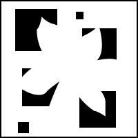
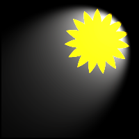
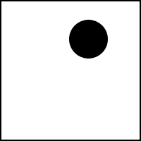
Figure-ground differentiation
(figure-ground relationship)
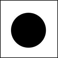
The depicted image should stand out from the background/environment so that you can recognize anything at all. The smaller area is usually seen as a figure, the larger as the image background. Therefore, this structure should be clear, so that it is understood by the viewer.
Law of proximity
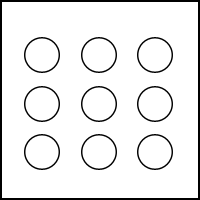
Togetherness; everything that belongs together or is brought together to form a group can be seen.
Law of similarity
Shapes that are similar are also perceived as a unit (togetherness) they are similar in color, shape or size
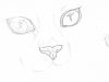
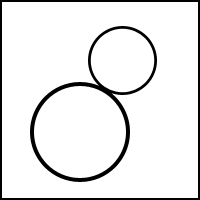
Law of unity
In the case of shapes or writing, we think of the missing part so that it forms a unit again.
We complete all figures (e.g. when they are placed in the bleed):
> however, this must first be learned by us
> for this reason one can exchange single letters also against symbols or forms and the word is understood nevertheless.
Conciseness tendency
Tendency to form a hierarchy, even if this is not actually mandatory:
> not every object can be in the foreground
> usually the lower object is defined as foreground
> In photos, for example, one focuses the foreground and blurs the background.
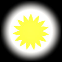
Information value
This results from the multitude of picture elements and the degree of complexity. The ratio of new, unexpected and known elements is decisive. Both depend on our experience and our individual knowledge. The fewer elements a picture contains, the faster it can be understood, the more details a picture has, the more difficult it is to grasp it and therefore seems rather overloaded. Too many as well as too few picture elements or new things in the picture can have a negative effect on the viewer.
Example: A laboratory is recognized as such by laymen if (for the layman) typical instruments are present and not only unknown elements.
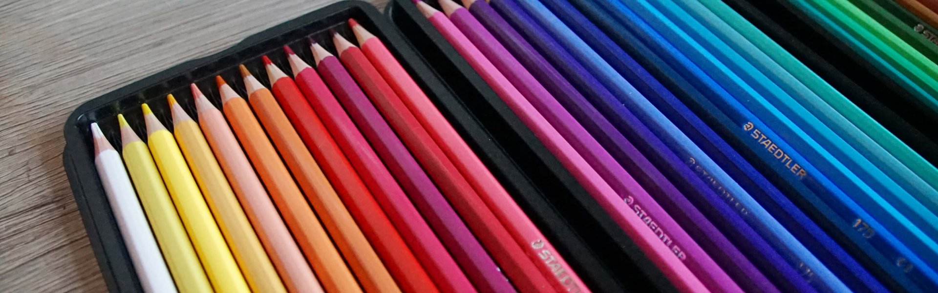
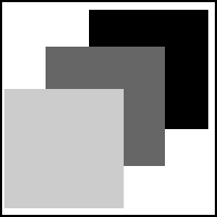
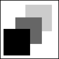
Contrasts

Contrasts form the contours of an image and build up an image, so it is one of the most important design elements. If the contrast distribution is one-third light, one-third medium and one-third dark, the image is perceived as varied and harmonious.
If there is only one very light or dark tonal value in the picture, the picture can also be perceived as attractive.
However, if an image consists only of midtones, it often appears boring and lacking in contrast. If an image is predominantly composed of only one tonal value, it is a high-key motif with light tones and a low-key motif with dark tones.
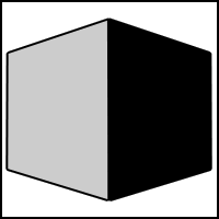
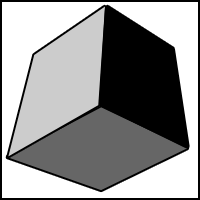
Lighting
Along with contrasts, it is an equally important design element. (Photography = drawing with light) Light is largely responsible for a spatial impression of an image. Diffuse, soft light makes an object appear two-dimensional; directional, hard light makes objects appear three-dimensional by creating shadows and conveys spatiality. Light also has a large part in how the mood of the image appears; ultimately it is also responsible for colors.
Backlight and sidelight
If you have the sun behind you and take pictures, you will have rather flatly illuminated images. This is less annoying for color images, but it is less advantageous for black and white images because the tonal value contrasts are rather low.
If you want to avoid this, you have to change the position a bit. Side light guarantees a more vivid illumination of a subject (true for colorful and achromatic images).
Perspective
Different perspectives make a picture look particularly interesting or ordinary.
Eye perspective/ normal perspective
(also central perspective)
Objects are shown smaller the further away they are from us. In central perspective, the spatial impression is created by the fact that the object is on the same plane as the viewer. A vanishing point in the distance, towards which all lines are pointing, gives us spatiality and depth. Objects that move along the vanishing lines towards the vanishing point appear smaller to us.
Frog perspective
It is an unusual perspective for us and therefore attracts attention.
However, one should not exceed a certain limit, as an overly abstract representation can meet with rejection from the viewer. Due to the low viewer angle, the horizon and vanishing point shifts towards eye level. Objects depicted in frog perspective are visually elevated, towering and can even appear oppressive (from above).
Bird’s eye view
This is also an unusual perspective for us. The vanishing point is pushed to the lower edge of the image by the elevated viewer angle. This creates an impression of bottomlessness and falling depth (as with canyons). Objects appear smaller, more insignificant (the viewer is raised into the air).
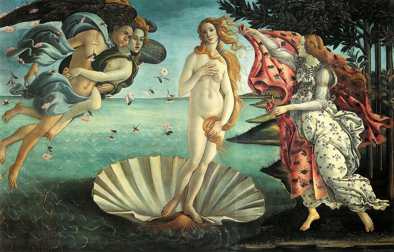
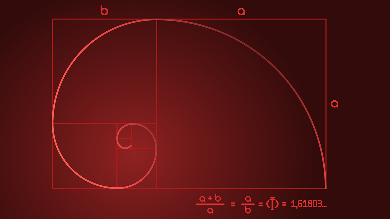
Golden section
The opposite division of symmetry is asymmetry. This looks more lively, harmonious and almost randomly arranged. One of the most commonly used balanced asymmetries in image division is the golden ratio. The most important element of an image is placed one third of the total height and width of the image to the left and right of the image border, respectively.
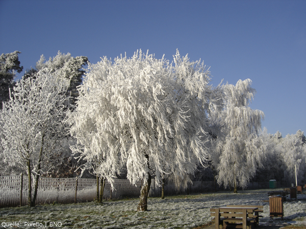
Total sharpness
Total sharpness – extending evenly over the entire image – has a decisive influence on the image effect. Sharpness is both informative and incorruptible, but it can also appear cold and sterile. It can be used depending on the desired image statement. If the information content of an image is important (e.g. descriptions of technical devices), total sharpness is essential. However, total sharpness can also be used to emphasize an ice-cold winter landscape.

Selective sharpness
The human eye per se only perceives an angle of view of about 1.5 degrees as razor-sharp.
However, our eye is constantly moving and scanning our surroundings, so we perceive a wider field of view as sharp. So we can’t see our entire environment completely in all sharpness with one glance, so an appropriately designed image with selective sharpness (the image is only sharp at a selected point/level) is particularly appealing to look at. By focusing on the most important element of your image, so to speak, you visually highlight and emphasize it at the same time; it is vividly emphasized.
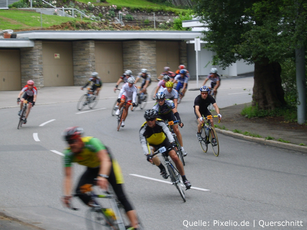
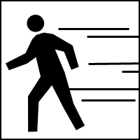
Motion blur
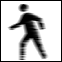
Photos or other still images, unlike moving images, have no direct way of illustrating motion. However, motion blur can be used to conjure up an illusion of motion. In photography, this is achieved either by using slow shutter speeds to create an out-of-focus blur, or by pulling the camera along in the direction of motion to create a sharp object against a blurred background. In painting, you can let the color run along in the opposite direction to the direction of movement to achieve an effect similar to that of a photograph.
When drawing, you can indicate this with action lines.
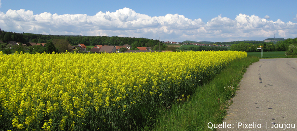
Landscape

If you use the right image format for a motif, the mood can be influenced considerably. Horizontal motifs/image elements (horizon) are further enhanced in their effect by an extreme landscape format. The greater the difference between image height and image width, the more attention the image attracts. Lines and shapes in the image that run in the opposite direction (in this case vertical lines), however, weaken the effect again. An image format that is drawn out in length radiates calm and expansiveness.
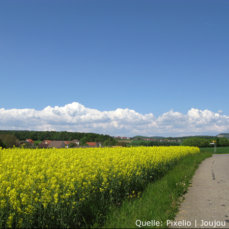
Square format

One of the most variable image formats, besides the rectangle, is the square. You can easily make a portrait or landscape image out of it afterwards. With its sides of equal length, the square image format is tensionless and static. However, a well-designed image content can create dynamics and tension. Image content and image format interact directly with each other.
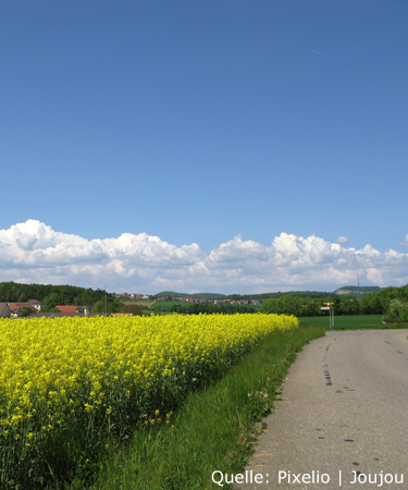
Portrait format
The rectangle is quite often represented as an image format. The subject should decide whether it should be a portrait format or a landscape format. The portrait format, in contrast to the landscape format, looks powerful and active. Here, too, more extreme aspect ratios can emphasize the corresponding format properties in the image.
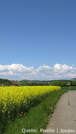
Foreground, middle ground and background
For a better spatial representation, you should clearly separate your image into foreground, middle ground and background. A typical composition would be a silhouetted suggestion of the foreground; which leaves space for a figure in the middle ground and reveals the place of action (background).
Texture gradient

As distance increases, the spaces between equally spaced vertical or horizontal objects become smaller and smaller; this is the texture gradient (example: utility poles along a highway). We assume that objects of equal size are also of equal size and can perceive spatiality by making these objects smaller.
Silhouette
Due to certain lighting (backlighting and low lighting), a silhouette effect can occur and the contours of the objects can stand out clearly from the rest of the bright surroundings. However, this strong contrast and the low tonal gradations can also be to blame for a low perception of details of an object. However, the high contrast gradient also provides a good spatial impression and can promote figure-ground relationships.
Aerial perspective
Aerial perspective is also a feature of distance and spatiality. In landscapes, as distance increases, the contrast of staggered objects decreases due to increasing blueing, which is caused by denser atmospheric haze. The farther an object is, the more it is lost in the blue of the sky.
Planarity

If there is no spatiality in a picture, it needs other elements to be interesting. A surface, as a two-dimensional structure, would be such an element. Besides the light-dark contrast and different color tones, you can also use linear structures or geometric shapes.
Line management
The lines within an image are also an important design element.
The statement of a picture is varied by the respective course of the lines. Lines can connect or separate. A straight line appears rather static and rigid, while a bent or curved line appears lively and dynamic. When lines meet, right angles, squares, rectangles, triangles or polygons can be created. These lines do not always have to be visible in the picture, imaginary lines give a picture much more charm.
Right angle
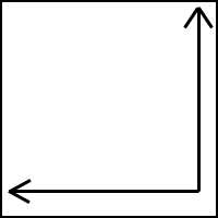
When a horizontal and vertical line meet, a right angle is created. The horizontal line usually appears static and calm, whereas the vertical line radiates dynamism and excitement. The effect of the two is therefore opposite. The right angle thus contains both effects; it thus contains a half-static and half-dynamic meaning.
Horizontal
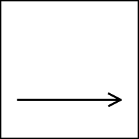
The horizontal line has a static and passive effect on the viewer, but it can also radiate calm or even appear boring. Most often it is the horizon line that appears as the horizontal line in an image (hence the name). The picture is cut into a darker lower and lighter upper half, the horizon line runs exactly in the middle of the picture. Such symmetry looks contrived and boring. It is recommended to use an asymmetrical division in the ratio 1:3 or 1:6 or vice versa.
Vertical
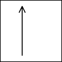
It radiates steadfastness and vitality and is perceived as an emerging force. However, several verticals in a picture should not be placed directly on top of each other, but better next to each other (negative example of a person with a telegraph pole “growing” out of his head).
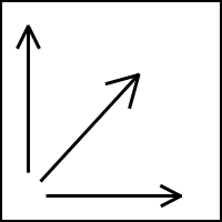
Diagonal
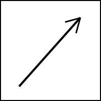
It radiates movement and striving away. For most people in Western culture, the diagonal from the bottom left to the top right is perceived as positive because of the usual reading and writing direction. The opposite diagonal, on the other hand, is perceived as negative.
Counterdiagonal
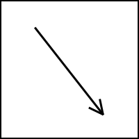
Most people of the western culture feel the counter diagonal as a falling movement and as a descent.
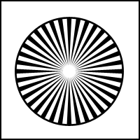
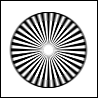
Circle
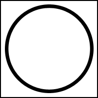
It is a self-contained original form. From the center, it has a uniform extension in all directions. Its effect is enveloping and protective (perfection). As an oval, it loses its central rigor and balance. With the oval, either the vertical or the horizontal orientation predominates, and therefore it can appear passive and static as well as aspiring and active.
Arch
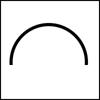
This symmetrical figure has a connecting character, such as a bridge.
Symmetry

Symmetry arises when the same picture elements are repeated, be it by lining up, rotation or mirrored arrangement. Symmetry radiates rigor, clarity, and calm, and is easy to grasp. However, it can also occasionally appear boring.
This page as PDF
Download this page as a PDF document! For teachers, students, knowledge collectors. 😉
➡ PDF: Design laws – Basics of design
Additional Pages
From the German Blog
- Blurring the Background – Feature of Spatiality
- What Geometry Reveals About You
- Creating Tilt-Shift / Miniature Effect in Photoshop
From the German Forum
- Law of Familiarity or Experience
- Law of Equality or Similarity
- Law of Prägnanz or Good Form
- Law of Figure and Ground
- Laws of Proximity and Closure