Design magazine titles
You can find out the rules for designing magazine covers here. Magazine covers, such as magazines, must be interesting and encourage people to buy. The first thing the customer sees is the cover page and should already be interested in picking up the magazine on the cover page – the first hurdle has been overcome!
Cover page design
There are certain “guidelines” for the design of magazine covers that every magazine follows. The list shows the basic rules for designing magazine covers, among other things. Here you can see an overview list of the most important design guidelines:
Title/ Headline top
- The headline should be as large as possible
- Eye-catching / usually across the entire width
Target group-dependent typography
- bold, playful font = appeals more to women
- straight, constructed font = appeals more to men).
Image overlay
- For small image motifs (images above the headline).
- Centered (the images must not cover the first or last letters of the headline).
- Title overlay for very large image motifs (the headline on the image).
Seasonally adapted title page/ background color
- should arouse interest in the content
- e.g. bright, friendly colors in spring, dark, warm colors in autumn, cool colors in winter, etc.
- Corresponding themes (Easter/ spring, summer, Halloween, Christmas etc.)
“Full” titles
- you get a lot for your money
- for target groups with little money; example youth magazines (these are also rather colorful and flashy; example Bravo).
The most important/comprehensive topics
on the cover; several different ones.
- You only buy the magazine if you are interested in a topic.
- There is 1 main topic, which is particularly large and centered.
- The second most important topic (possibly) is also highlighted somewhat larger.
- The remaining topics are the same size (“equally important”); this results in a clear calmness as far as the topics are concerned.
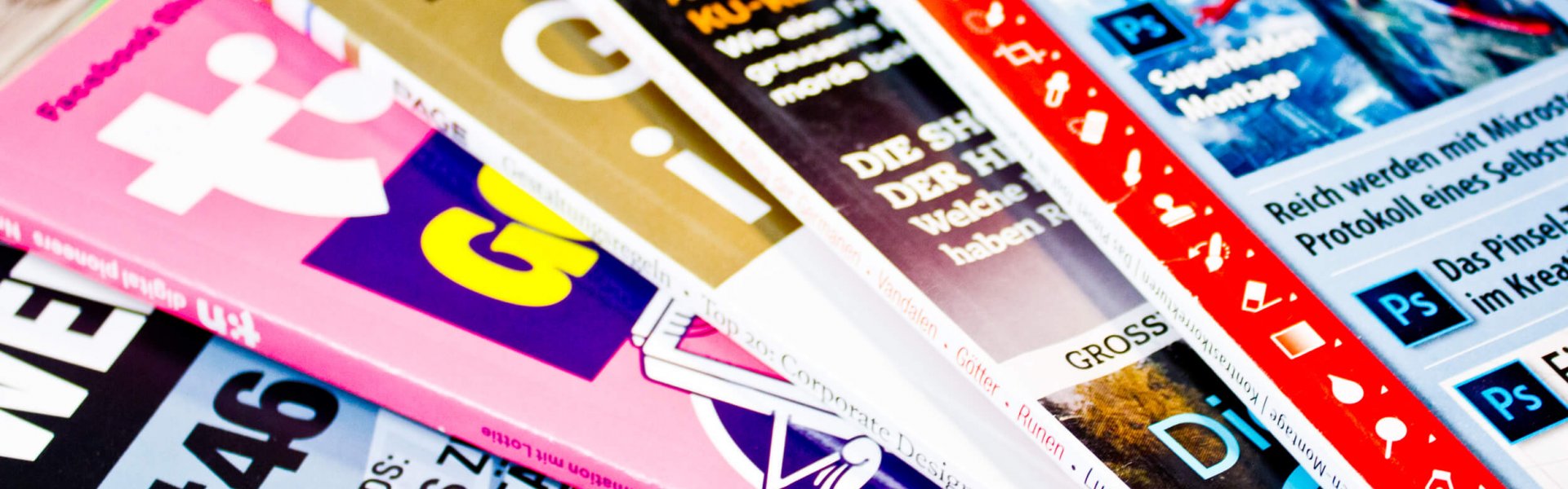
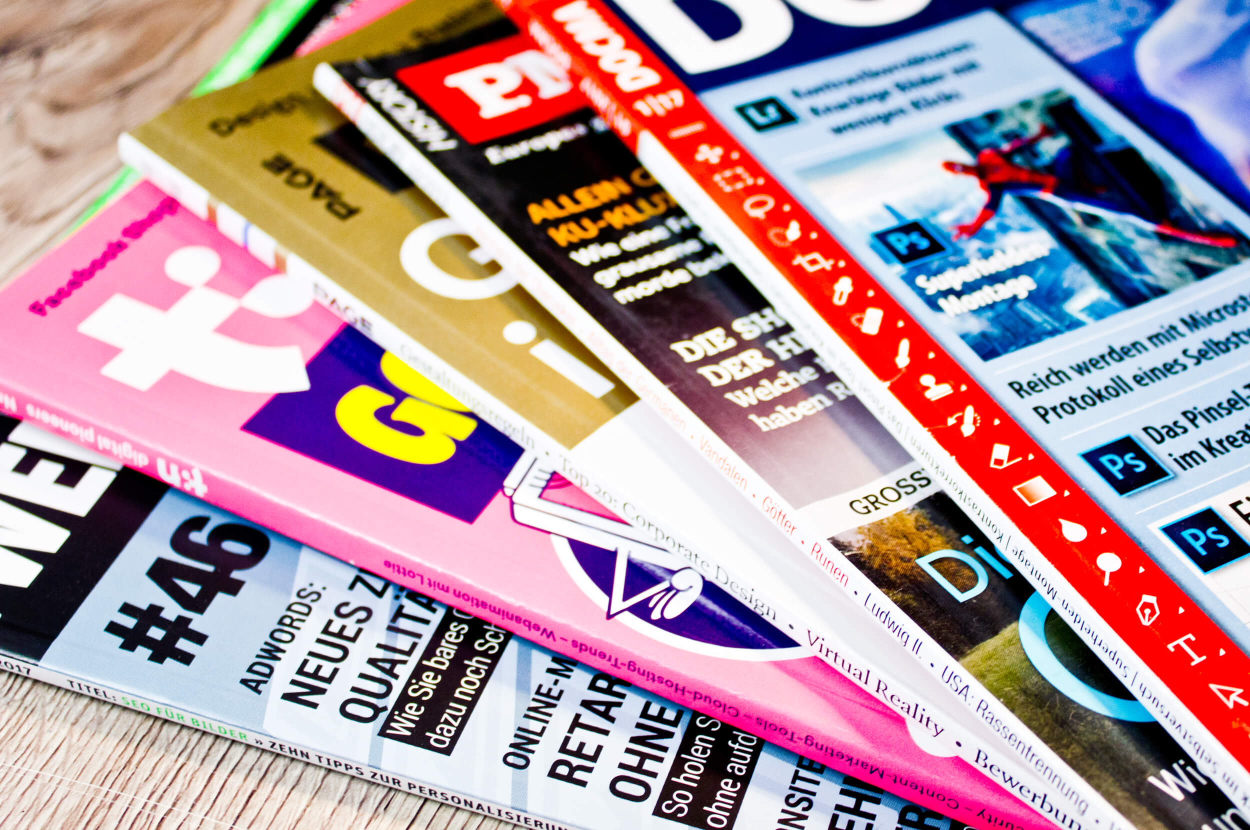
- If there are several topics, the most important topics are on the left, as magazines are stacked on top of each other and thus partially obscured (see graphic).
- The headline is at the top so that it can still be recognized in the stacked arrangement (see graphic).
- This ensures that the magazine can still be recognized and found on the magazine rack or shelf.
The typography should stand out
- by its size or colorfulness.
Images in the magazine title
- The model/motive should appeal to the target group
- (either representing the target group, such as in women’s magazines, or arousing the desire of the target group; for example, an attractive woman in a men’s magazine).
- The image should match the main theme (e.g. Easter baskets, Christmas motifs on seasonal themes, woman in a summer dress if it’s about fashion, muscular man if it’s about workout tips, etc.).
A consistent layout is important to me.
- The footer at the bottom; for example with “Stern View” or “Frau im Spiegel”
- = the title varies, but not the colors; they always look “the same”.
Target group-independent layout
- Examples “Stern Magazin”, “Focus-Magazin” etc. do not define in advance whether the target group should be male or female
- therefore the same layout color is always used
- mainly for business, political or science magazines.
More Pages
- Shading / Drawing Shadows
- Perspective Drawing
- Principles of Design
- Designing Posters
- Designing Logos
From the German Blog
- Drawing and Designing Reflections
- Creating a Photoshop Collage: Mythical Creature Griffin
- Creating Silhouettes in Photoshop
- Creating a Tilt-Shift / Miniature Effect in Photoshop
- Creating Metal Effects in Photoshop
- How to Identify a Good Graphic Designer
- Blurring Backgrounds in Photoshop with Masks
- Easily Recolor Photos with Selective Color Correction