Color Theory
The basic principles of color theory are the perception of color and color mixing. Colors give a picture a special touch. They allow us to create moods and impressions that would not be possible without them. However, randomly mixing colors rarely yields the desired result. That is why renowned figures such as Goethe and Runge have studied colors and attempted to classify them. Color design follows certain rules. Here you can see what those rules are and how they can be applied.

The Effect of Colors
Each color is characterized by its nature, its intrinsic brightness, and its relationship to other colors. Pure red can be aggressive and dynamic; pink (red mixed with white) tends to appear sweet, delicate, and shy; when mixed with black, it conveys dignity, seriousness, and so on.
- According to Goethe, colors can be divided into “active” and “passive”:
Active colors – red, yellow, orange
Passive colors – blue, green, violet - Saturation, brightness, and contrast
If a color lacks hue and its saturation is zero, it is an achromatic color (white, gray, black). A pure color, unmixed with other colors, has the highest saturation. Every color possesses its own brightness. - Color associations/color meanings
It is generally believed that every color has a specific meaning and effect. You can consciously use these associations to give your image a corresponding expressiveness. Some of these meanings are downright symbolic; for example, red is used to symbolize love, yellow for envy, green for hope/nature, white for innocence/purity, and black for death/mourning (although the symbolism of black and white in some Asian cultures means exactly the opposite of what it does in the West; there, for example, black is synonymous with happiness and white with mourning).Other associations are not universally valid, but have simply come about through perceptions, culture, and surveys of large groups of people.
Colors and Their Meanings
In addition to their symbolic meanings, colors also have a very specific effect on us as humans. They can influence our moods and either stimulate our emotions or have a calming effect.
| Color | Meaning/Symbolism | Effect |
|---|---|---|
| RED | Vitality, activity, dynamism, willpower, danger, struggle, blood, love, passion, warmth |
|
| ORANGE | Joy, liveliness, fun, warmth, exuberance, energy, endurance |
|
| YELLOW | Maturity, warmth, strength, success, happiness |
|
| GREEN | Hope, relaxation, calm, naturalness, cheerfulness |
|
| BLUE | Calm, infinity, friendliness, freshness |
|
| VIOLET | Subconsciousness, mysticism, spiritual power, inspiration, magic |
|
| PINK | romance, love, tenderness |
|
| BROWN | Comfort, Adaptability, Heaviness, Nature / Earth | |
| WHITE | Purity, Cleanliness, Order, Innocence, Perfection, Calm | |
| BLACK | Mourning, Restriction, Isolation, Darkness, Hopelessness, Heavy | |
| GRAY | Neutrality, desolation, sobriety, misery, objectivity, simplicity | |
| GOLD | Wealth, power, elegance | |
| SILVER | Purity, wealth, coolness, simplicity, modern, elegant | |
Seeing Colors
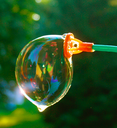
The study of color also involves understanding why colors exist and what colors actually are. Light is essential for color vision Light. When light hits an object, it is either reflected (completely or partially = colors), absorbed (black), or it shines through (transparent, colorless). Depending on which light waves are reflected and reach the eye, the resulting color is determined.
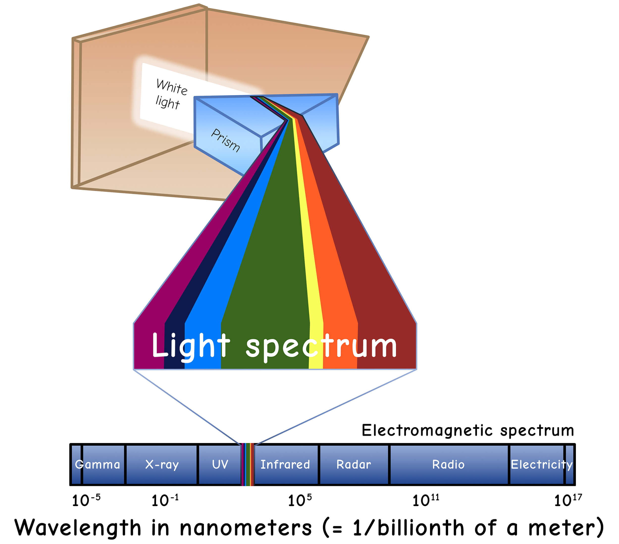
Light Spectrum
Our “white” light contains all of our colors. When light is refracted—for example, through a prism or, as in nature, through tiny water droplets (which creates a rainbow)—the spectral colors become visible.
These colors always appear in the same order: violet, blue, cyan, green, yellow, orange, red
The colors on the left are so-called long-wavelength colors (violet), while the colors on the right are short-wavelength colors (red). Light is thus part of natural “radiation.”
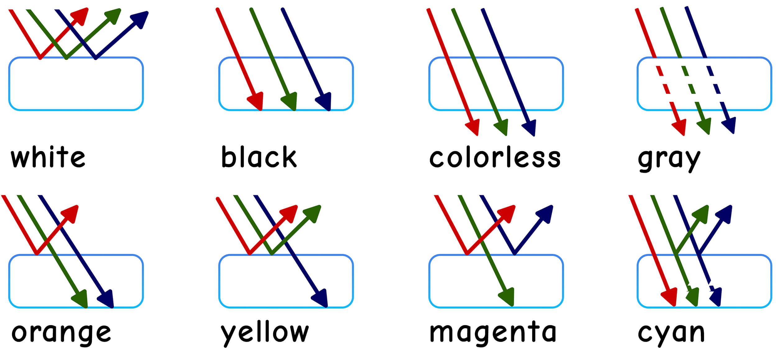
Color Perception of the Human Eye
It is important to note that our eyes contain sensory cells only for red, green, and blue. The brain calculates the color we ultimately perceive based on these three colors and the combination of light received. Since green tones predominate in nature, our eyes are particularly sensitive to these shades.
When all (red, green, and blue) light waves are reflected, the eye sees white; when they are absorbed, we see black; when they pass through, we see colorless. If red and green are reflected and blue is absorbed, we see yellow; and so on…
Color Classification Systems
Color classification systems serve as an introduction to color theory. Even the great scholars of the past sought to give structure to colors and arrange them logically.
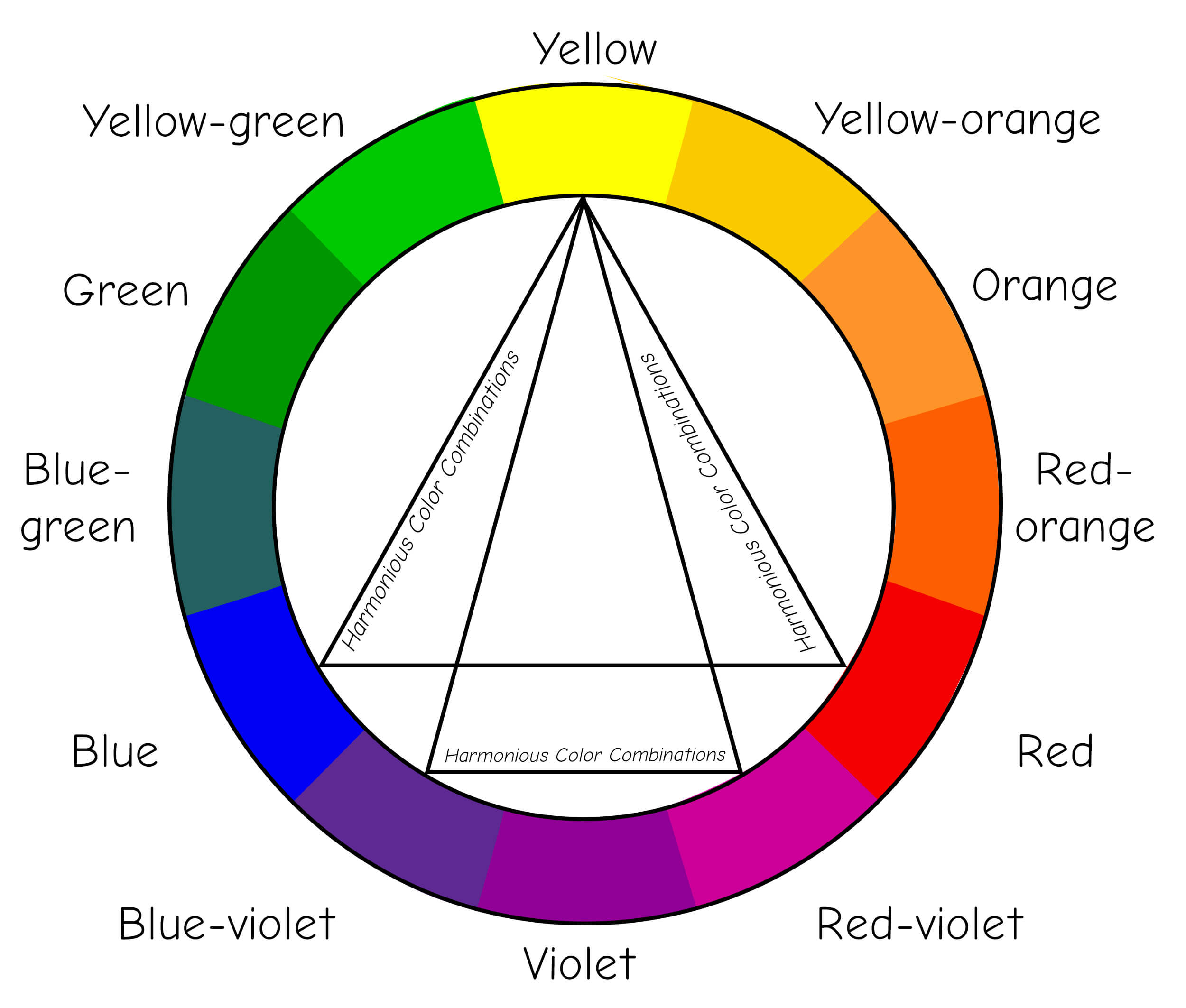
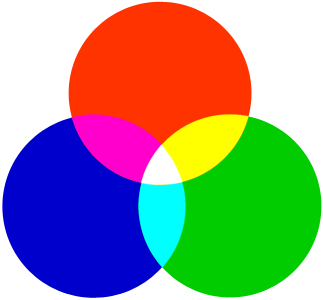
Color Wheel
This is the color wheel according to Johann Wolfgang von Goethe. The three primary colors are shown in relation to one another, along with the secondary colors derived from them. The three primary colors—blue, red, and yellow—and their secondary colors: red-blue, yellow-green, and blue-green.
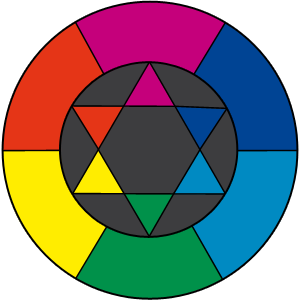
The color wheel shows the primary colors and their mixed colors. Colors that are directly opposite each other are called complementary colors. In addition, there are color pairs that look particularly harmonious when combined. These pairs are linked together in the center of the color wheel. The three primary colors and their mixed colors on the color wheel: Red and yellow make orange, red and blue make purple, and blue and yellow make green.
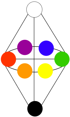
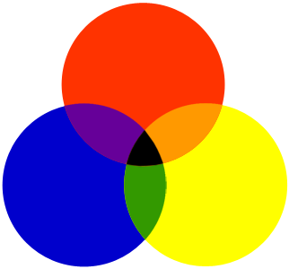
Double Cone
This is Wilhelm Ostwald’s Double Cone. It depicts the primary colors, their mixed colors, and the gradations from black to white. In addition to the primary and mixed colors, the color cone also includes gradations toward black and white.
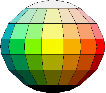
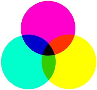
Color Sphere
This is the color sphere by Runge. In theory, it displays all colors. The color sphere contains even more colors than the color cone. A simplified example!
Color Spaces
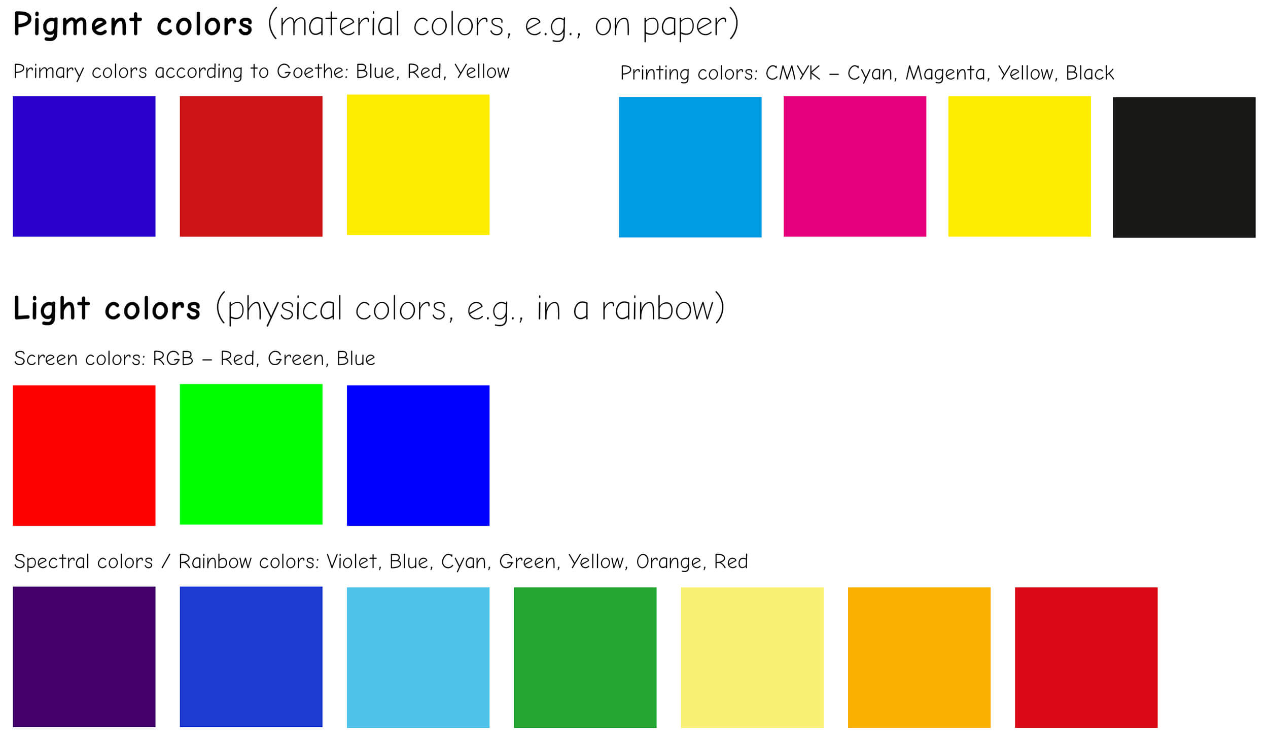
Generally, there are two types of colors: pigment colors and light colors. The differences and similarities between them are explained below.
- Screen colors/light colors (monitors, computer screens, projectors, etc.) consist of RGB colors
- Print colors/solid colors (e.g., printed journals and magazines) are composed of CMYK colors.
Solid colors or pigment colors also include, for example, oil paints, acrylic paints, solid and tinting paints, etc. – however, these are not subject to either the RGB or the CMYK color space.
Color Mixing
In color theory, there are three different color mixing systems. First, there is the classical system, which every child learns in elementary school. Then there is the physical system, which relates to the colors of light, and finally the printing system, which is used everywhere from home printers to the advertising industry.
Additive Color Mixing
- Mixing of colored light
- Brightness increases with mixing
- The sum of all colors is white
Subtractive color mixing
- Mixing of pigments
- Brightness decreases
- The sum of all colors is black
Subtractive (Autotypic) Color Mixing in Printing Inks
- Form of subtractive color mixing
- Application in the printing industry (color printers/printing presses > CMYK = Cyan Magenta Yellow Black)
- Primary colors correspond to the secondary colors of additive color mixing (Cyan, Magenta, and Yellow)
- The sum of all colors is black (in practice, however, it is more of a dark gray-brown; therefore, black is always used as a separate printing ink to increase brilliance)
- Mixed colors are the primary colors of subtractive color mixing
Color Contrasts
Another aspect of color theory is color contrasts. The differences and similarities between colors, colors that influence each other’s effect… Here I present the 7 color contrasts along with example photos.
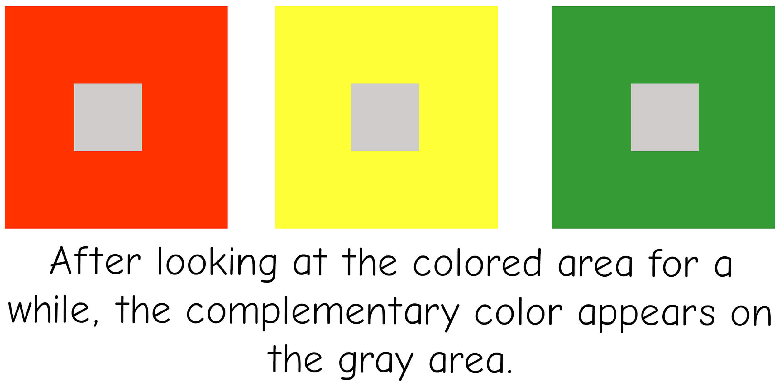
Simultaneous contrast
The eye *craves* the complementary color. This effect arises in the brain and does not actually exist (successive). The reality of a color is not identical to its effect > the simultaneous effect can be enhanced or prevented by placing shades of gray along the edges or in the center.

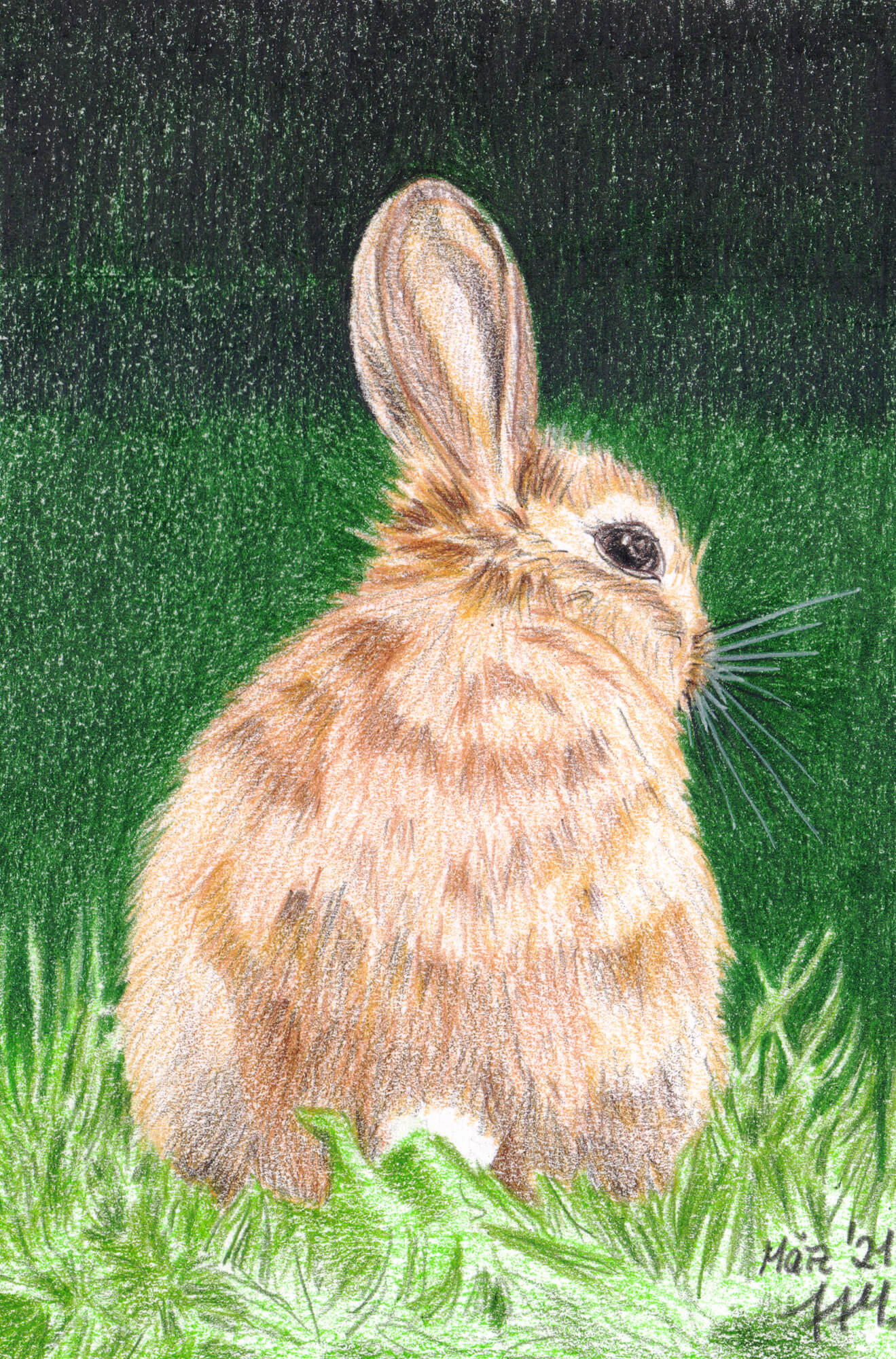
Light-Dark Contrast
Brightness (tonal value) determines how colors interact with one another. Yellow is the lightest, violet the darkest. The strongest light-dark contrast is between red and turquoise. Black reduces a color’s brightness, while white enhances it… this allows for the enhancement of weaker contrasts.
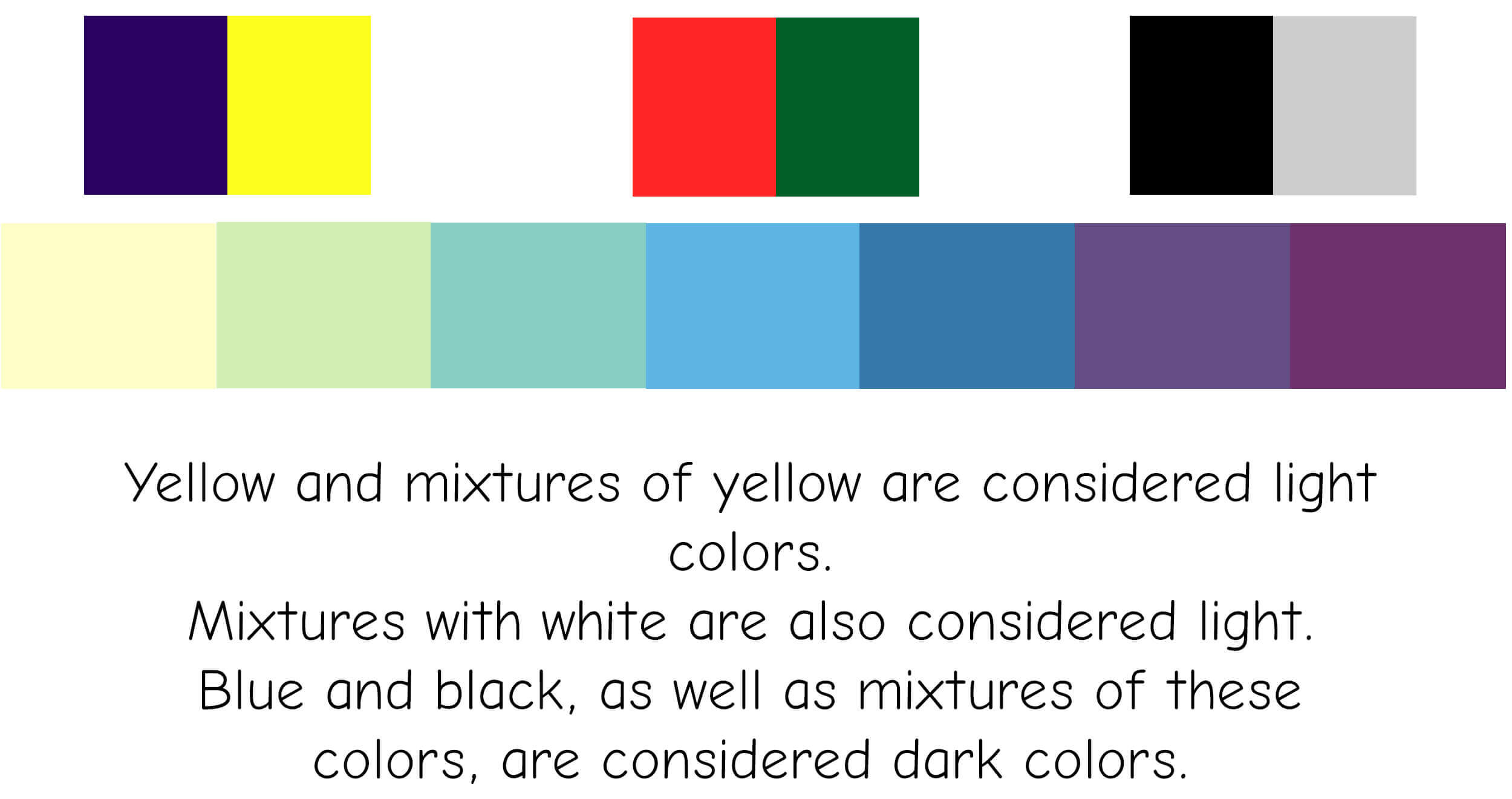
Example of use
The light brown bunny stands out clearly against the dark green background.
Complementary contrast
Complementary colors are directly opposite each other on the color wheel. They enhance and intensify one another. Each color has only one complementary color. They appear as an afterimage in the eye (successive = if you look at a green surface for a long time and then look at a white one, you see red… you see it even though the surface is white.
The brain thus *demands* the complementary color and creates it > simultaneous contrast!). The complementary pair forms the basis of harmonious color design.
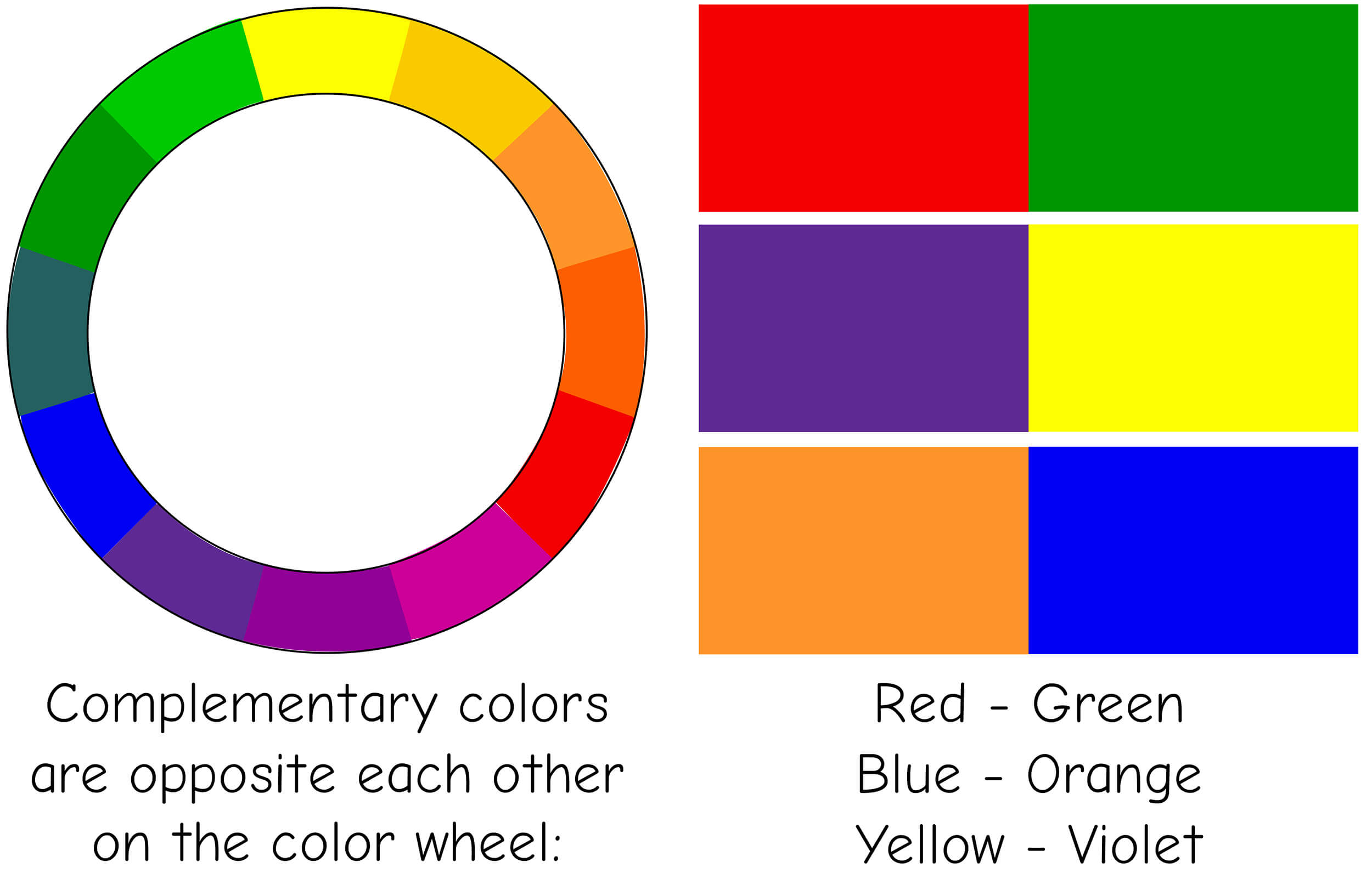
The most typical complementary color pair is red and green. Traditionally, this is seen very often at Christmas: the green tree decorated with red ornaments. Ever since I trained as a window dresser, I have associated complementary contrast with Christmas.
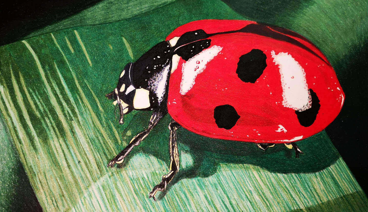
Application example
But my ladybug picture also features a typical complementary contrast, namely the two colors mentioned: green and red.
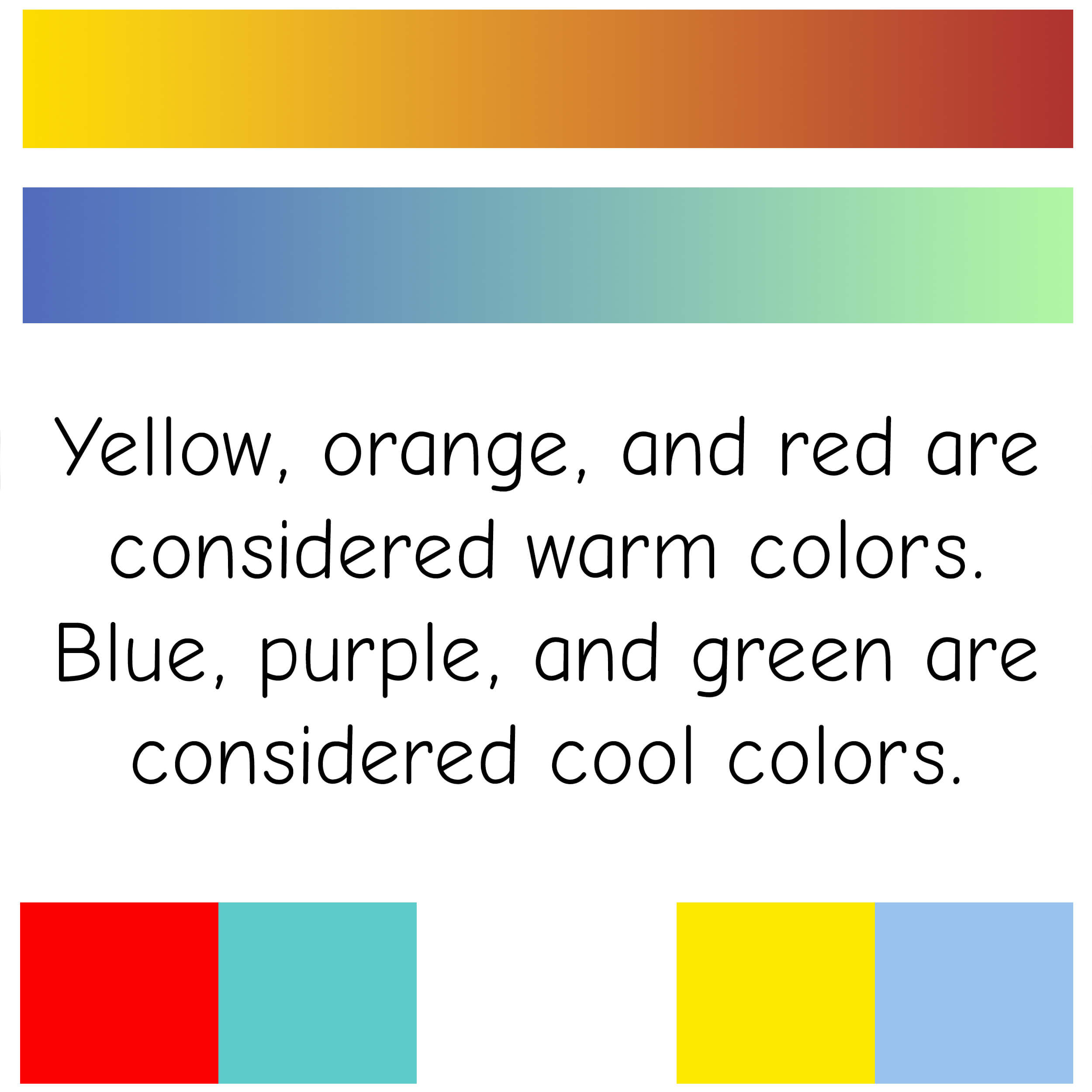
Cold-Warm Contrast
Distant objects appear colder. Cool colors are a good way to create a sense of perspective and depth. Colors evoke sensations of temperature. This contrast is also important for the color design of interiors…
A color can appear both cool and warm in relation to other colors. Blue and violet are generally perceived as cool. Red and orange are perceived as warm. Yellow and green can be perceived as both warm and cool.
Example of Use
The girl’s red outfit and golden-blonde hair are warm colors. This contrasts with the cool blue background, the white ice skates with silver blades, and the snowflakes, which further emphasize the icy atmosphere.

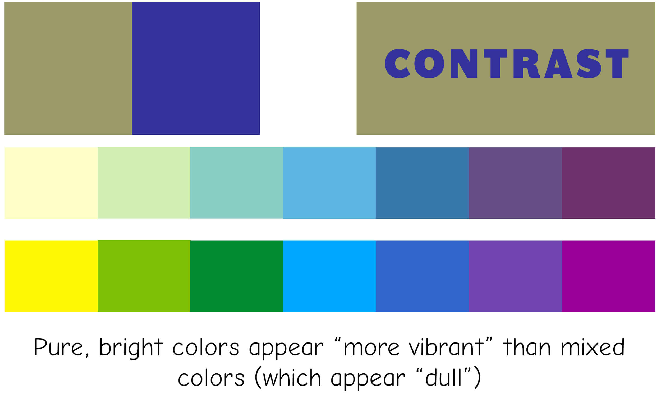
Quality contrast
(Also known as tone-on-tone contrast, referring to the same color with multiple shades)
Here, the degree of purity and saturation of the colors is decisive. The opposites are saturated/vibrant colors and dull/muted colors. When lightening (with white) or darkening (with black, gray, or the complementary color), the colors lose their luminosity—in other words, you *break* the colors.
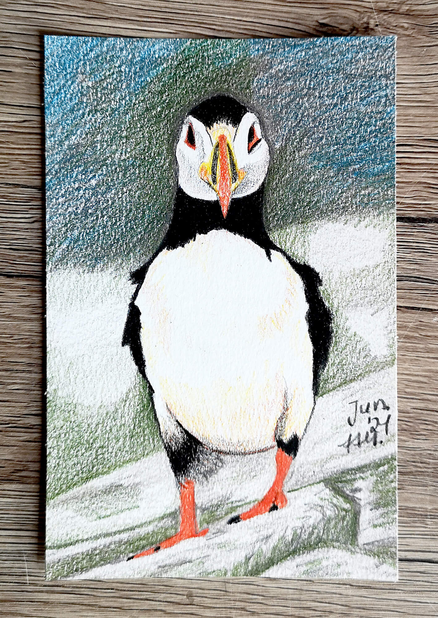
Example of use
The bright red feet and beak stand out sharply against the black-and-white plumage and the gray-green-blue background.
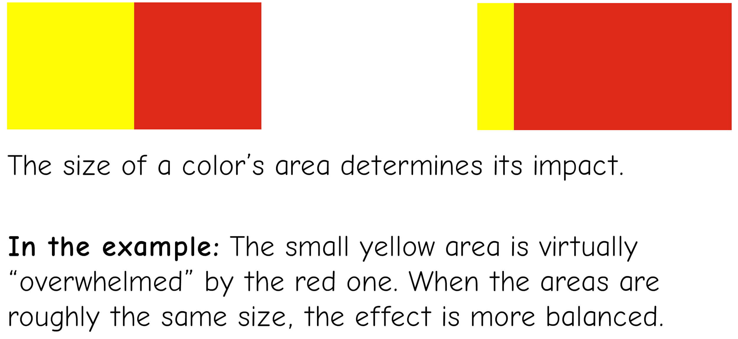
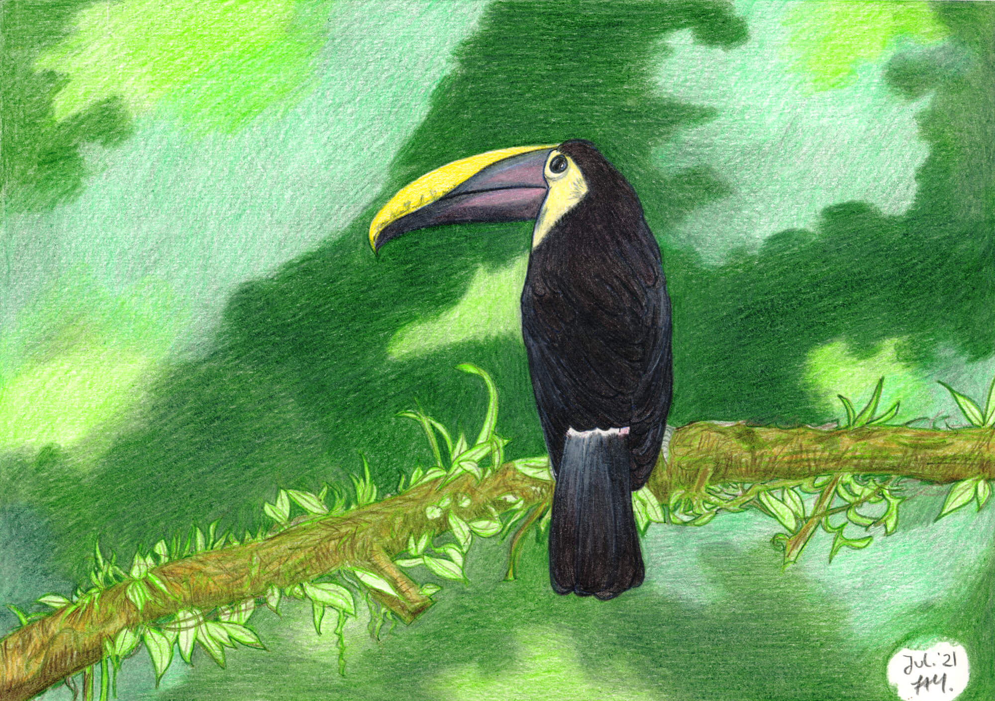
Quantity Contrast
This contrast refers to the size of the colored area and the ratio of these areas to one another. The opposites are much and little, large and small. Luminance and spot size determine the color effect. To better assess luminance, colors are compared on a neutral background (gray). The intensity of the effect varies. Goethe determined the following light values:
The numbers indicate the ratio in which the sizes of the areas of the respective colors should be.
Yellow/violet = 1:4
Orange/blue = 1:3
Red/green = 1:2
Example of Use
The black toucan stands out clearly against the green background due to the strong contrast. The yellow on its beak and head, in turn, contrasts sharply with its black plumage.
Color-in-itself contrast
(Also known as the color-achromatic contrast)
This is the simplest form of contrast. It involves the use of at least three different, unmixed, pure colors. The effect is always colorful. Black and white can be used as dividing lines between the colors to influence the effect. White weakens the colors, while black enhances their intensity.
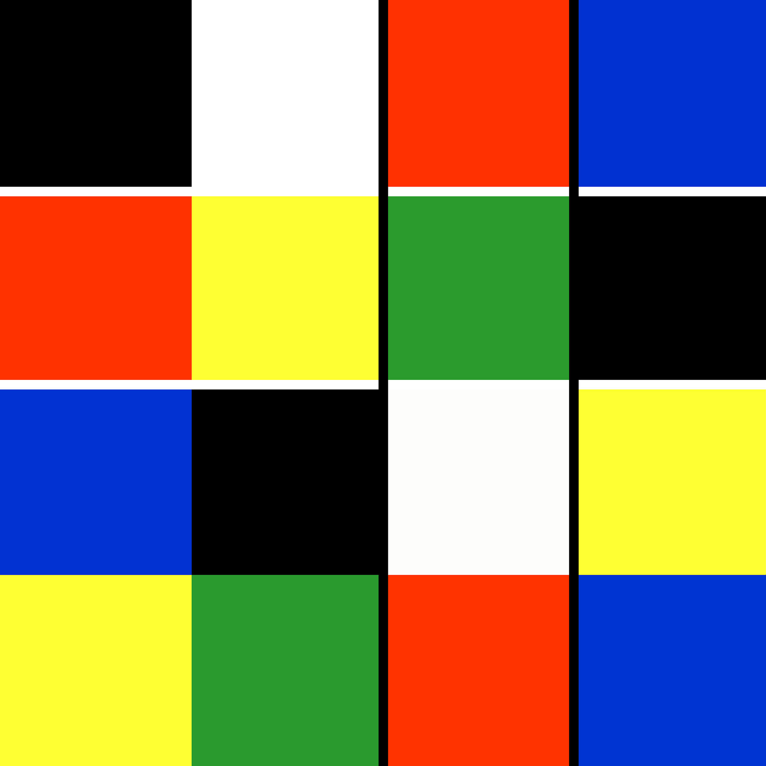
Example
In the example of the ladybug, the three (four) pure colors are: the red of the ladybug, its black spots (as well as the white reflections of light), and the green of the background.
More Pages