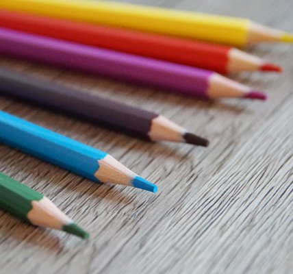
Choosing the right drawing paper can make a big difference, especially when you’re just starting out with drawing. Whether you’re sketching with pencil, working with markers or trying out watercolors, each paper has its own characteristics that affect the outcome.
In this article, I will introduce you to different types of drawing paper, explain terms such as grammage and graininess and give you tips on which paper is best suited to your drawing projects.
This will help you quickly find the ideal material for a successful start in the world of drawing!
My beginnings

To take away your fear of doing something wrong or coming out as “stupid”, I’ll start by telling you about my experiences with drawing paper. After all, beginners are inevitably stupid, because without experience or instruction, you simply can’t know any better 😉
When I started drawing, I didn’t care what kind of paper I used. I used whatever I could get my hands on. In the early 90s, my choices were mainly limited to discarded stationery, college pads or drawing pads for art class.
Since I drew a lot with ballpoint pen and pencil, mainly from my head, and was in the discovery and diligence phase at the time anyway, this was perfectly fine.
It wasn’t until years later that I found out that there were also special papers for special purposes, but at that time you couldn’t get them easily in retail stores, but in special art supply stores. This is still partly the case today (as of early 2025). But thanks to online retail, you can now get everything at any time. A new problem therefore arises here: Separating the wheat from the chaff, i.e. distinguishing the quality from the cheap product (more on this under “Brands”).
What terms such as grammage and graininess mean was initially unclear to me, but trial and error and especially my second vocational training as a media designer quickly enlightened me.
Prices – What Should You Spend?
The purpose determines the price.
If you’re still practicing and doing quick sketches that mostly end up in the trash, classic printer paper is a great choice at first, as it offers the best price-performance ratio.
If your exercises are more detailed and “worth keeping,” you should also place more value on the quality of the paper used. That can then cost a bit more.
Price Winner: Printer Paper
Printer paper usually comes in A4 size and 80 gsm, making it relatively thin, with a slightly rough surface to help ink from inkjet printers (for which these papers are optimized) absorb particularly well. You can get a pack of 500 sheets for 4–10 euros.
Price per sheet ≈ €0.0008
This makes it unbeatable in price and, for many, THE drawing paper for beginners.
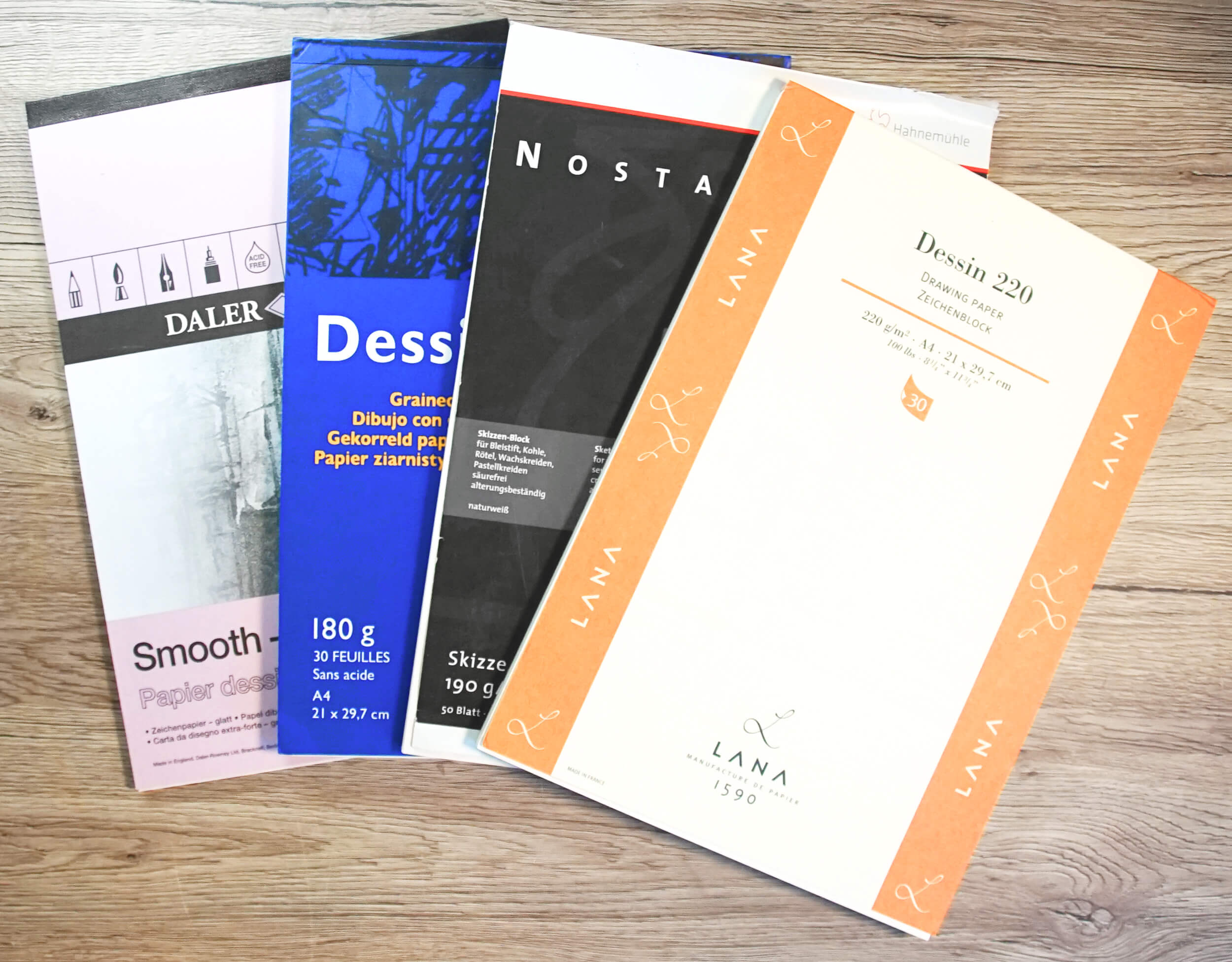
Sketching / Drawing Paper – Now It Gets Serious!
At some point, every ambitious artist reaches a point where printer paper is no longer sufficient because quality demands increase. Affordable sketch paper for beginners can be found in discount or surplus stores (Action, Tedi, Lidl, Aldi, Kaufland, etc.) or from your favorite online shop.
These papers are sold in pads rather than single sheets, sometimes even as rolls, and typically come in packs of 10–100 sheets starting at €0.70 and up.
Key price factors include:
- Size – DIN A3 is, for example, more expensive than DIN A4
- Thickness – thinner papers are cheaper than thicker ones
- Quantity – paradoxically, pads with fewer sheets are more expensive than those with more
💡 Pads with 10–20 sheets are usually FineArt papers and especially pricey
💡 Pads with 50–100 sheets are intended for bulk use and usually not as high in quality
Free Samples / Sample Sets
There was a tip in the drawing forum to contact one of the paper manufacturers directly via email to request free samples. If you’d like to try a specific type of paper without obligation, this is a good approach. Back then, I expected a few loose sheets but actually received an entire pad (maybe a blogger bonus ^^).
Whether manufacturers are still this generous is something everyone has to test for themselves. But if you ask nicely, you’re likely to get a free sample. 😉
There are also manufacturers who offer curated product samples for sale. These sample packs are also a great way to test out different types of paper.
Brands & Quality
Due to international online trade and the increasing range of clearance market products, it’s easy to lose sight of true quality. Just because something is more expensive or has an elegant presentation doesn’t automatically mean it’s of high quality. On the other hand, not every budget-friendly product is necessarily inferior. When it comes to art supplies, I’ve found that branded products are usually the better option if you want reliable quality. This can also include private labels from retail stores.
Paper, too, comes from various brands, mostly produced by paper mills.
While you might look for printer manufacturers when buying printer paper, with artist paper, you’ll become familiar with the names of paper mills.
Some notable examples include
- Arches
- Canson
- Crescent
- Clairefontaine
- Daler Rowney
- Fabriano
- Hahnemühle
- LANA
- Rayher
- Strathmore
- Schoellerhammer
- …
Some manufacturers of art supplies, like colored pencils or watercolors, also produce or commission their own paper (e.g., DERWENT or Winsor & Newton).
Additionally, some art retailers offer private-label brands that are ideal for beginners to test different materials at a low cost.
💡 You can find a comprehensive list of common artist supply brands on my blog: Which brands offer artist materials?
Paper Sizes
Most people have probably noticed that paper comes in different sizes. However, not everyone is aware that there are different format systems you may encounter when buying paper, depending on the manufacturer and its intended use.
Here, I’ve compiled an overview of common paper formats and explained their origins and usage.

DIN Formats – A8 to A0
In Germany, most people are familiar with the 💡 DIN A formats, which have described standardized paper sizes since 1922. They were originally developed from the paper and printing industries and later widely adopted in office environments. The base format A0 equals exactly 1 m2 and is halved in size with each increasing number.

Other formats, such as envelope sizes (DIN C) and items like folders or printers, have adapted to these.
| Format | DIN Format in mm | DIN Format in cm |
|---|---|---|
| A0 | 841 x 1189 | 84.1 x 118.9 |
| A1 | 594 x 841 | 59.4 x 84.1 |
| A2 | 420 x 594 | 42.0 x 59.4 |
| A3 | 297 x 420 | 29.7 x 42.0 |
| A4 | 210 x 297 | 21.0 x 29.7 |
| A5 | 148 x 210 | 14.8 x 21.0 |
| A6 | 105 x 148 | 10.5 x 14.8 |
| A7 | 74 x 105 | 7.4 x 10.5 |
| A8 | 52 x 74 | 5.2 x 7.4 |
| A9 | 37 x 52 | 3.7 x 5.2 |
| A10 | 26 x 37 | 2.6 x 3.7 |
US Formats
Since Americans don’t use the metric system, they have their own paper sizes, which differ from the DIN A formats we’re familiar with. For example, standard letter paper is about 5 cm taller and also a few centimeters narrower than DIN A4.
Overview of US Paper Formats
| Name / ANSI | Inches | Millimeters |
|---|---|---|
| Tabloid Extra | 12 x 18 | 304.8 x 457.2 |
| Tabloid / Ledger | 11 x 17 | 279.4 x 431.8 |
| Legal | 8.5 x 14 | 215.9 x 355.6 |
| Legal 13″ | 8.5 x 13 | 215.9 x 330.2 |
| Letter | 8.5 x 11 | 215.9 x 279.4 |
| Executive | 7.25 x 10.5 | 184.2 x 266.7 |
| Statement / Half Letter | 5.5 x 8.5 | 139.7 x 215.9 |
| Commercial #10 | 4.125 x 9.5 | 104.8 x 241.3 |
| Monarch | 3.875 x 7.5 | 98.4 x 190.5 |
| 5 x 7 Card | 5 x 7 | 127.0 x 177.8 |
| 4 x 6 Card | 4 x 6 | 101.6 x 152.4 |
DIN A Formats in Inches
| Format | mm | inches |
|---|---|---|
| A0 | 841 x 1189 | 33.1 x 46.8 |
| A1 | 594 x 841 | 23.4 x 33.1 |
| A2 | 420 x 594 | 16.5 x 23.4 |
| A3 | 297 x 420 | 11.7 x 16.5 |
| A4 | 210 x 297 | 8.3 x 11.7 |
| A5 | 148 x 210 | 5.8 x 8.3 |
| A6 | 105 x 148 | 4.1 x 5.8 |
| A7 | 74 x 105 | 2.9 x 4.1 |
| A8 | 52 x 74 | 2.05 x 2.9 |
| A9 | 37 x 52 | 1.46 x 2.05 |
| A10 | 26 x 37 | 1.02 x 1.46 |
Artist Formats
Why do some artist papers still come in completely different sizes? These are based on frame or mat dimensions and don’t correspond to either DIN A or US formats.
💡 According to Hahnemühle:
These artist formats have evolved over the decades (probably even centuries) and have since become standard, especially in watercolor, acrylic, and oil painting.
The following artist paper sizes are common:
- 17 x 24 cm
- 24 x 32 cm
- 30 x 40 cm
- 36 x 48 cm
- 42 x 56 cm (less common)
- 50 x 65 cm (sheet format)
- 100 x 70 cm (sheet format)
Grammage / Weight or Thickness
Depending on its intended use, paper comes in different weights, which are indicated in grams per square meter (g/m²) or in English, grams per square meter (gsm). The higher this number (also called grammage), the thicker the paper.
The thinnest types of paper—aside from tracing paper—are marker or layout papers, which usually range from 70 gsm to 80 gsm. Standard sketch and drawing papers are typically around 160 gsm, although they can vary from 90 gsm up to 220 gsm (sometimes even higher).
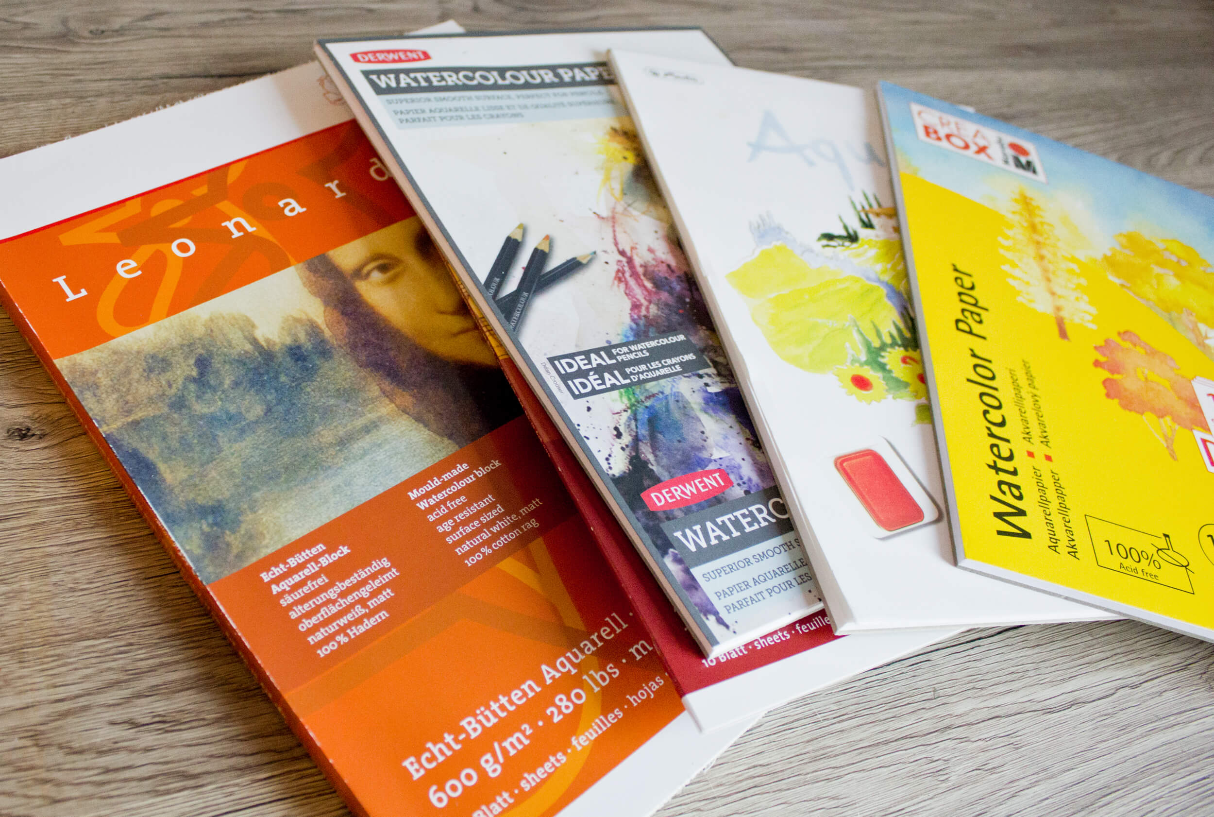
Watercolor paper, at around 300 gsm, is usually the thickest type of artist paper.
Paper, Cardstock, and Cardboard – What’s the Difference?
Paper, cardstock, and cardboard are often categorized based on their weight relative to size. This is called “area density”—meaning how many grams one square meter weighs (g/m²).
There’s a standard (DIN 6730) that defines the difference between paper and cardboard:
- Paper weighs between 7 gsm and 225 gsm.
- Cardboard weighs more than 225 gsm.
In everyday language, people often refer to “cardstock” when talking about materials that are thicker and sturdier than paper but lighter than cardboard. This classification is often used:
- Paper: 7 gsm to 225 gsm
- Cardstock: 150 gsm to 600 gsm
- Cardboard: from 225 gsm upward
Sometimes cardboard is defined with even higher weights, such as 500 gsm or even 600 gsm. The boundaries aren’t always clear, especially as manufacturing techniques continue to improve.
What Does This Mean?
Grammage helps us understand whether a material is thin and light (like regular paper) or thick and sturdy (like cardboard). However, it’s more of a general guideline than a strict rule, as classifications may vary.
In the world of artist paper, weights starting at 225 gsm are still often referred to as “paper”—even watercolor paper with 600 gsm. Still, terms like “drawing board” or “drawing cardstock” are commonly used to refer to particularly thick and durable sheets or pads.
Grain / Surface Texture
Paper is made from tiny wood fibers that are soaked in water and turned into a pulp. This pulp is spread over a fine mesh screen, through which the water drains, and then dried. The grain or surface texture of the paper is created either by the screen the pulp rests on or by special rollers that emboss the paper.

Hot Pressed and Cold Pressed
There are two important processes that affect the surface: hot pressed and cold pressed. In hot pressed paper, the still-wet sheet is pressed with hot, smooth rollers, resulting in a very smooth surface. This is ideal for fine details or line drawings.
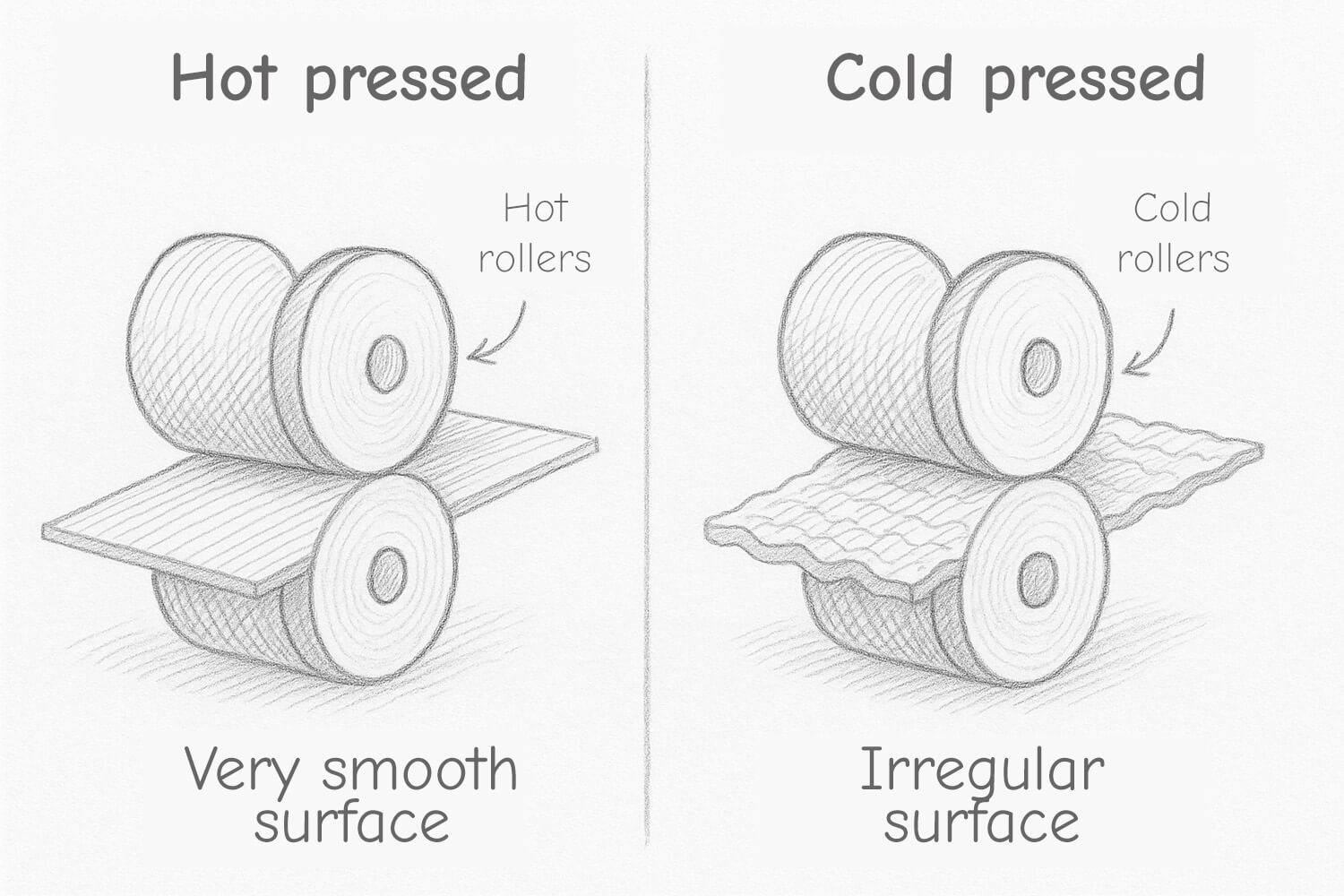
Cold pressed paper is pressed with cold rollers, which gives the surface a more irregular and slightly rough texture. This structure absorbs more pigment and is well suited for watercolor painting and techniques where the paint is meant to flow.
Coated Papers – Perfect for Vivid Colors
Coated papers receive a special layer, often made from fine chalk or clay powder. This coating is applied to the paper to make the surface smoother and more uniform. These papers are often used for printing magazines, books, and advertising materials, as they reproduce colors with great intensity and sharpness.
When painting or drawing on coated paper, the pen or brush glides easily across the smooth surface. This makes them ideal for techniques using markers, fineliners, or inks where sharp lines and vibrant colors are important. However, they can be difficult for very wet watercolor work, as the pigment doesn’t absorb well and tends to sit on the surface.
How Do Paper Surfaces Differ?
In addition to different paper colors, there are also various surface textures. These affect the drawing experience as well as the final result.
Whether you prefer smooth or textured, rough paper surfaces is entirely up to you and a matter of personal preference.
However, some media like charcoal or pastel chalks require rougher papers to achieve the right grip and pigment adhesion.
➡ The following information is not universally applicable, as the actual characteristics vary depending on the paper and the artist’s technique. Consider it a general guideline.
Satin Surface (extra smooth)
These papers have an especially smooth, sometimes shiny surface because they are pressed between hot rollers after production. They are also well suited for inks, fineliners, or fiber-tip pens.

🎨 Watercolor
Not suitable for watercolor, as the smooth surface absorbs little water. Colors don’t blend well and stay on the surface.
✏️ Pencil & Colored Pencil
Pencil lines appear crisp and precise. However, the surface is too slippery for colored pencils—layering colors is difficult because little pigment sticks.
Matte Surface (smooth)
Matte papers have a slightly textured surface, making them great for beginners. Also suitable for inks, fineliners, or fiber-tip pens.

🎨 Watercolor
A great choice for beginners. Colors can be applied with control, blend softly, and remain vibrant. Ideal for small watercolor sketches.
✏️ Pencil & Colored Pencil
Excellent for both: The slight grain gives enough grip for color to stick while allowing detailed work. Shading and transitions are smooth and easy.
Rough Surface (fine grain)
Rough papers have a grainy texture that becomes visible in painting. Not suitable for fineliners or fiber-tip pens.

🎨 Watercolor
Wonderful for vivid effects and expressive brushwork. The grain helps color blend and adds structure—especially in dry techniques. It brings depth and vibrancy to your paintings. Dry brush strokes leave small white “sparkles.” Wet-on-wet creates glowing contrasts. Colors can be lifted easily, offering flexibility.
✏️ Pencil & Colored Pencil
The grain creates visible texture with pencil—great for lively sketches. Colored pencils adhere well but may not cover evenly. The grain remains visible in broad color areas.
Extra Rough Surface (grain)
This type has a highly pronounced texture, clearly visible and tactile during painting and drawing. Not suitable for fineliners or fiber-tip pens.

🎨 Watercolor
Intense color effects and dramatic transitions: ideal for expressive, emotional works full of movement. The texture enhances sparkling highlights. Perfect for wet-on-wet techniques with strong color mixes.
✏️ Pencil & Colored Pencil
Pencil strokes may look uneven or grainy as the lead catches on the rough surface. Colored pencils produce vivid tones, but even coverage is difficult. Great for expressive styles!
Rule of Thumb: When to Use What?
- For detailed, realistic images: Matte surfaces.
- For expressive, painterly techniques or granulation: Rough or textured surfaces.
💡 Your taste and drawing feel are what matter!
There is no right or wrong. Enjoy the process and try different things!
Especially for beginners, experimenting is key. Only through practice can you develop your style and understand which materials best suit your desired results.
Which paper for which material?
Whether delicate pencil sketches, colored pencil drawings, bold marker paintings or vibrant watercolors – every medium needs the right paper to develop its full potential. In this overview you will find everything you need to know about artists’ papers.
➡ The following information is not universally valid, as the specific properties are heavily dependent on the paper in question and the skills of the artist. The information should therefore be seen more as a rough guide.
Sketching and drawing paper
- Paper surfaces make the difference
- Smooth (satin): Ideal for fine lines and details.
- Rough (textured): For bold lines, texture, and shading.
- Grammage indicates thickness
- 120–150 gsm for pencil, from 180 gsm for charcoal and intense shading.
- Satin papers
- Allow the pen to glide smoothly, ideal for technical drawings and details.
- Textured papers
- Hold more pigments, perfect for charcoal, hatching, and expressive effects.
- Cotton paper = professional quality
- Highly durable, does not yellow, absorbs pigments exceptionally well.
- Acid-free paper
- Prevents yellowing – important for archival quality.
- Coated paper
- Smooth surface, but pigments like charcoal adhere poorly.
- Paper formats
- Blocks = more stable, don’t slip.
- Loose sheets = flexible, need to be fixed.
- Rough paper for charcoal
- Creates dramatic light-dark contrasts and “grippy” lines.
- The right paper influences the result
- Texture, thickness, and surface determine how the tool reacts.
10 Tips for Sketch & Drawing Paper
- Try both smooth and rough paper – each creates different effects.
- Use paper of at least 180 gsm for charcoal or mixed media.
- Secure loose sheets with tape.
- Choose smooth paper for fine lines, rough for shading.
- Use acid-free paper for long-lasting artworks.
- Cheap paper for practice, high-quality for serious works.
- Kneaded eraser = gentle correction without damaging the paper.
- Use a protective sheet underneath to avoid smudging.
- Archive your works: fixative, folders, no direct sunlight.
- Be brave and experiment: test formats, textures & brands!
Watercolor Paper
- Absorbency is key
- Watercolor paper absorbs water well – for clean gradients.
- Hot Pressed
- Smooth surface, ideal for details and illustrations.
- Cold Pressed
- Lightly textured – perfect for soft transitions and landscapes.
- Rough Paper
- Strong grain = exciting effects & natural textures.
- Paper weight matters
- 300 gsm or more = no warping even with lots of water.
- Cotton = professional quality
- Best color brilliance, good correction possibilities.
- Coated watercolor paper
- Richer colors, but less absorbent – rarely used.
- Blocks or Sheets
- Blocks are glued on all sides – ideal for wet-on-wet technique.
- Acid-free = long-lasting
- Colors stay vibrant, paper doesn’t yellow.
- Every brand is different
- Differences in sizing, texture, drying behavior – testing is worth it.
10 Tips for Watercolor Paper
- Test many types – paper greatly affects style & technique.
- Tape down single sheets – prevents warping while painting.
- For important works: Use high-quality 100% cotton paper.
- Choose paper based on subject: smooth for details, rough for texture.
- Cotton paper = more room for corrections thanks to longer drying time.
- Pre-stretch paper when using a lot of water.
- Cheap paper for sketches & color studies.
- Wavy paper? Slightly moisten the back, press flat.
- Colors appear differently depending on surface – compare!
- Sharing with others brings new techniques & ideas.
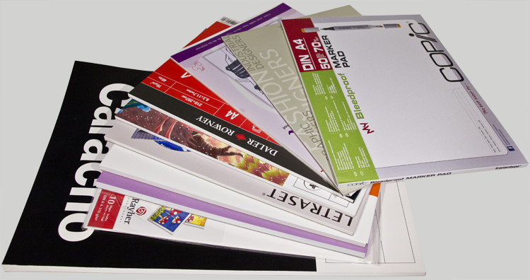
Marker / Layout Paper
- Special Coating
- Marker paper is usually coated on one side so ink stays on the surface instead of soaking in.
- Very Smooth
- The surface is extremely smooth to protect marker and fineliner tips.
- No Bleed-Through
- Good layout paper prevents marker ink from bleeding through to the back.
- Vibrant Colors
- Marker colors appear more intense and brilliant on proper layout paper.
- Thin but Strong
- Usually between 70–100 gsm – feels thin but is surprisingly durable.
- No Smudging
- The coating allows ink to dry quickly and remain sharp and clean.
- Not Erasable
- Pencil lines are hard to erase because rubbing may damage the surface.
- Non-Absorbent
- Unlike watercolor paper, marker paper barely absorbs liquid – no bleeding.
- Translucent
- Many layout papers are slightly transparent – ideal for sketches or light tables.
- Single-Sided Use
- Often only the coated side is usable – the backside remains blank.
10 Tips for Marker / Layout Paper
- Use a test sheet: Try new markers on a small scrap to see how the paper absorbs the ink.
- Use few layers: Avoid excessive layering – after about 5 layers, the paper is nearly saturated.
- Work from light to dark: Apply light colors first to achieve clean transitions.
- Use a protective sheet: Place a sheet underneath – just in case the ink bleeds through.
- No hard erasers: Use a kneaded eraser to avoid damaging the coating.
- Use fineliners last: Outline after coloring to prevent bleeding.
- Suitable for layering: Layering works – in moderation.
- Fix if needed: Use UV-protective fixative for finished presentation pieces.
- Don’t fold it: Since marker paper is thin, folds can ruin the image – store it flat.
- Not for water: Even water-based brush pens may smudge – always test first.
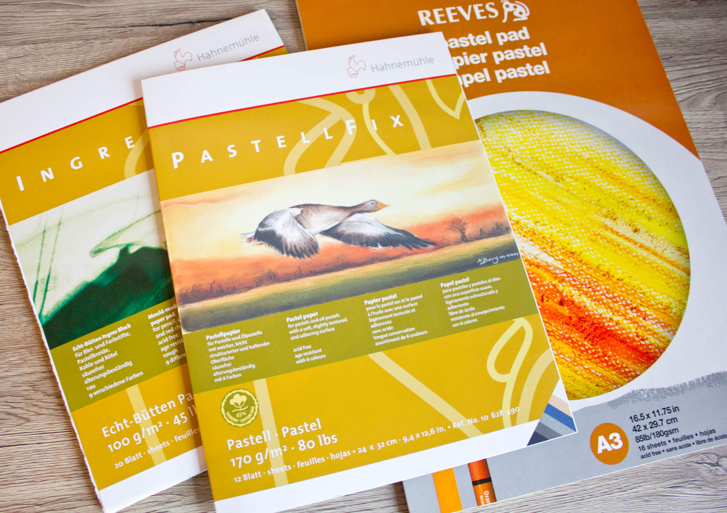
Pastel Paper
- Texture
- Pastel paper is rough or grainy so the chalk can adhere properly.
- Color variety
- There are many tints that strongly influence the image – from warm earth tones to cool grays.
- Paper weight
- Grammage ranges from thin (100 gsm) to very sturdy board (360 gsm).
- Adhesion properties
- Depending on the surface, up to 30 layers of pastel can be applied.
- Workability
- Some types can be rolled (e.g. Ingres), others cannot (e.g. Pastelmat).
- Smudgeability
- Smudging ability varies by surface – Velour and Mi-Teintes are softer, Pastel Card is rougher.
- Durability
- High-quality types are acid-free, pH-neutral, and resistant to aging.
- Need for fixative
- Some types require little to no fixative (e.g. Pastel Card).
- Material consumption
- Coarse-grained types like Pastel Card consume significantly more chalk.
- Intended use
- Not all papers are suitable for hard pastel pencils – Velour, for example, only to a limited extent.
10 Tips for Pastel Paper
- Choose the paper color intentionally – depending on whether your artwork should appear light, dark, or warm.
- Use test strips – especially on colored or heavily textured paper.
- Use soft pastels – on highly adhesive surfaces like Pastelmat or Velour.
- Avoid finger blending – on delicate or sanded paper – better use applicators or sponges.
- Use fixative sparingly – only on papers that smudge easily – some papers hold pastel well without it.
- Store drawings flat and protected – ideally between parchment or tissue paper.
- Avoid erasing – pastel paper is unforgiving – better to revise than erase.
- Test combinations – e.g., pastel pencil on coarse paper or hard pastel on smooth paper.
- Take your time choosing paper – it strongly influences your style and the final result.
- Avoid moist hands – Velour or Pastelmat can be damaged – better work with gloves.
Mixed Media Paper
- Versatile use
- Designed for combining dry techniques with watercolor, gouache, acrylic, or ink.
- Medium to high weight
- 200–300 gsm is ideal to handle both water and layers of dry media.
- Texture
- Lightly grained to fine rough: provides grip for dry media without blocking wet techniques.
- Special sizing
- Prevents the paper from weakening or warping too quickly when wet.
- Less absorbent than pure watercolor paper
- Allows ink and markers to stay sharp and vibrant.
- Surface types
- Mostly cold pressed or natural white – hot pressed (smooth) is rare.
- Ideal for layering techniques
- Allows layering of colors, lines, collage elements, etc.
- Stable for processing
- Wrinkles and warps less than regular sketch paper.
- Available as pad, spiral-bound, or single sheet
- Can be chosen based on technique and workflow.
- Not all mixed media papers are the same
- Some favor wet media, others dry – testing is essential!

10 Tips for Mixed Media Paper
- Choose paper with at least 200 gsm – otherwise it will warp when using water.
- Combine media purposefully – e.g., watercolor areas with colored pencil accents.
- Use paper with a slightly rough texture – to give dry media better grip.
- Work in layers – well-sized paper can handle it.
- Fix dry media – (e.g., charcoal) before applying wet colors over it.
- Use markers on mixed media paper – instead of watercolor paper – lines stay clearer.
- Let each layer dry well – before applying the next.
- Use masking tape or fix the paper – when working with wet techniques.
- Be bold – collage or texture paste often works well on mixed media paper too.
- Try different brands – some lean more toward watercolor, others are better for markers.
Pads or Sketchbooks?
What should you get – paper pads or sketchbooks? In the end, this is a question everyone has to answer for themselves.
Sketchbooks are very popular because, just like a book, you can flip through your sketches and drawings. It’s a beautiful way to store your work and invites a bit of nostalgia.
If the creative process makes it harder to use a book, then loose sheets, pads, or other formats might be a better choice. A sketchbook can also feel intimidating, especially if you’re hesitant to draw “just” practice sketches or exercises in it. The pressure you put on yourself can become a barrier.
Most people likely start with loose sheets or pads anyway. That’s why sketchbooks can be a nice addition to your usual paper formats, but they’re not essential.
Small Paper Glossary
To wrap up, here’s a short list of paper-related terms and their explanations, especially useful when choosing drawing paper.
Basic Paper Terms
| Term | Explanation |
|---|---|
| g/m² / gsm | Paper weight: grams per square meter (the higher, the thicker/sturdier) |
| Grammage | Same as g/m² – indicates how heavy and thick the paper is |
| Paper thickness | Measured in millimeters – doesn’t always reflect weight |
| Volume | Ratio of thickness to weight – e.g., “high volume = thick but lightweight” |
| Grain Direction | Fiber direction – important for folding or bookbinding |
Surface and Texture
| Term | Explanation |
|---|---|
| Grain | The visible and tactile texture of the paper |
| Tooth | The grip or roughness – how well it holds dry media like pencil |
| Hot Pressed (HP) | Smooth surface, ideal for fine lines (e.g., ink, marker) |
| Cold Pressed (CP/NOT) | Slightly textured surface, great for watercolor |
| Rough | Very textured, ideal for expressive techniques and texture effects |
| Satin / Satiné | Silky-smooth surface, often slightly shiny |
| Surface sizing | Coating that affects water absorption (especially in watercolor paper) |
For Specific Uses
| Term | Explanation |
|---|---|
| Watercolor Paper | Highly absorbent, usually with strong texture |
| Marker Paper | Specially coated – prevents marker bleed-through |
| Sketch Paper | Thin, inexpensive – ideal for fast sketches |
| Mixed Media | Versatile – handles water and other media well |
| Pastel Paper | Has a rough or velvety surface for pigment adhesion |
| Velour Paper | Very soft paper with a fabric-like surface – popular for pastels |
| Layout Paper | Very thin and smooth – ideal for tracing or marker layouts |
| Tracing Paper / Vellum | Semi-transparent – often used for transferring drawings |
Formats & Binding Styles
| Term | Explanation |
|---|---|
| Pad / Spiral Pad | Paper bound in a pad or spiral – often easily detachable |
| Sketchbook | Hardcover, often used on the go |
| Leporello | Accordion-folded – continuous paper, great for urban sketching |
| Loose Sheets / Single Sheets | Large individual sheets, often artist-grade |
| Edge Glued / Fully Glued | Paper glued at one edge or all sides – stays flat when wet |
Foreign Terms (often found on packaging)
| Term | Explanation |
|---|---|
| Bristol | Smooth, heavy paper – ideal for ink and markers |
| Cartridge | Medium-quality drawing paper – common for sketching |
| Dessin (fr) | Drawing or design |
| Sketch (en) | Sketch – quick preliminary drawing |
| Drawing / Draw | Drawing / to draw (English) |
| Croquis (fr) | Rough draft – often used in fashion and art |
| Illustration Board | Heavy board with mounted paper – for professional artwork |
More Pages
From the German Forum